Art.25 ECP
UX and frontend for an Enterprise Control Platform, built for the age of AI.
Context
Art.25 Consulting is building an AI-native SaaS platform for organisations preparing for advanced AI systems, interconnected enterprise risk, cyber disruption and continuous regulatory accountability. The team I work closest with is three people: the founder, a developer and me.
Goal
One connected platform for AI governance, enterprise risk, resilience, compliance and assurance, replacing the disconnected lines of defence and siloed ownership that organisations work with today.
My role
Member of technical staff, product and creative. I own UX/UI for the platform and implement the frontend myself.
Result
In development. What I can show here is the way of working rather than the product: how a feature goes from a regulation to a screen when the team is small, the domain is unfamiliar and the deadline is always now.
Duration
June 2026 – ongoing
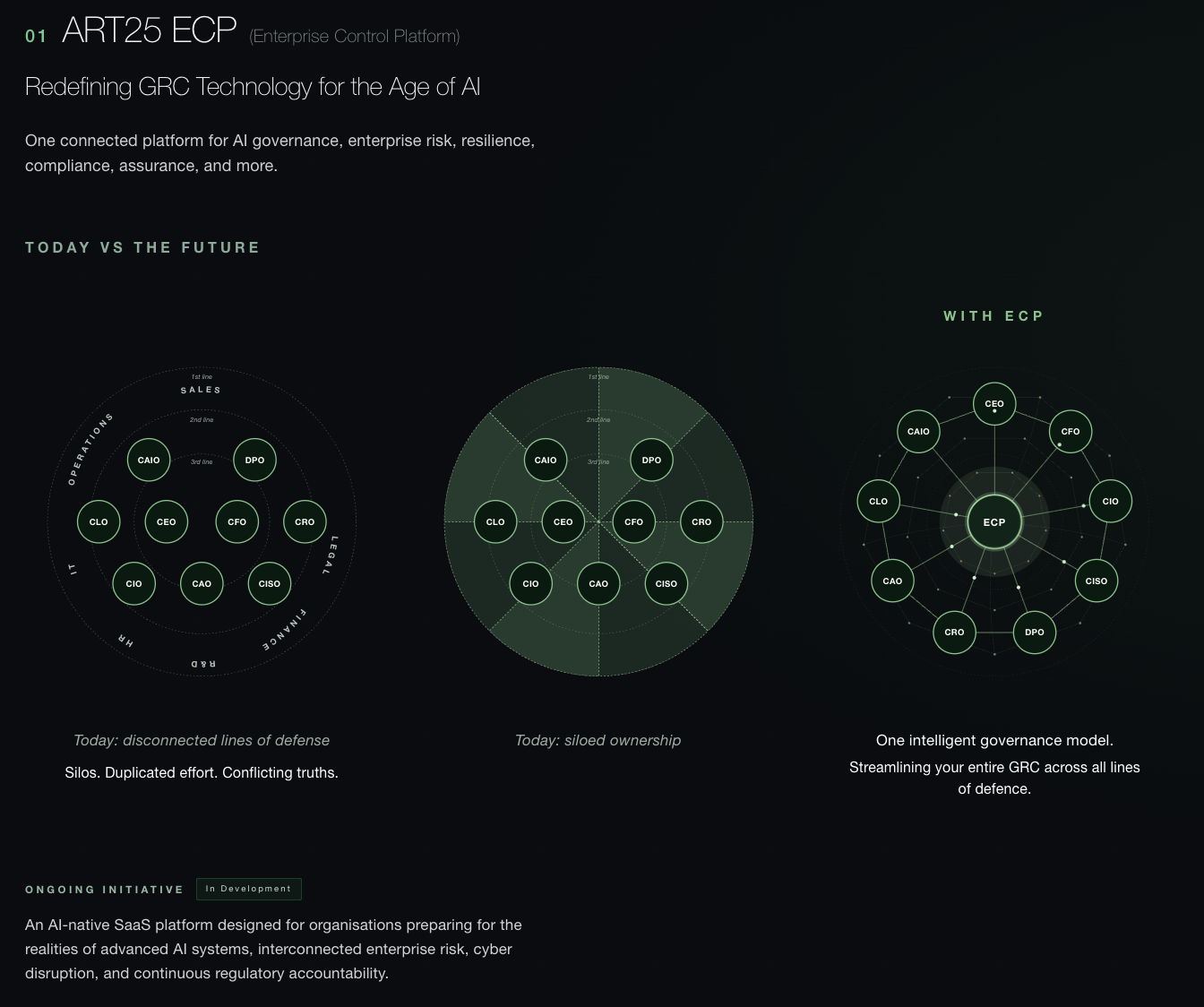
The platform, from the Art.25 website
What I can show
The platform is still in development and at a critical point in it, so nothing of it can be shown here: no screens, no flows, not privately either. What follows is the method instead.
Who I design for
The founder acts as a domain-expert user I test ideas on, given his long experience in the field. Beyond him, the company has design partners working in the field who I run usability tests with.
How I work on a feature
Roles before screens. I map the roles inside a company that the platform touches, a Data Protection Officer, a Chief AI Officer, a Chief Risk Officer and the rest, and what each of them owes, both to the regulation and to each other. That happens before anything is drawn. Those relationships decide what a person may see, what they may do and what they can be asked, so getting them wrong means designing the wrong screen accurately.
Draft the map with AI, correct it with the founder. I draft the persona map with AI to have something concrete within the hour, then take it to the founder, who knows the domain far better than any model does. The draft is there to be argued with, not agreed with.
Read the regulation itself. I go to the actual article the form refers to, not a summary of it, because I want to understand the thing I am designing for rather than someone else's account of it. The wording decides what has to be asked, of whom, and in what order, and reading it in full is what repeatedly changes the design. The detail that matters is rarely the one that survives into a summary.
Draft fast, then do the real work in Figma. I draft quickly with AI and export into Figma through MCP, so it arrives as real layers rather than a picture of an interface. The detailed work happens there: states, spacing, edge cases, variations compared side by side.
Fine-tune against the map and the article. I check the result back against the role map and the regulation text, and meet the founder regularly to test my interpretation of both.
Implement it myself. I build the result in frontend, which closes the gap between what was designed and what ships.
Let AI hold the thread between meetings. I use it to track what changed between versions and to collect the open questions for the next meeting.
How I built the dashboard palette
Professional and forward-looking, and still the brand. The dashboard is built from widgets, most of them carrying a graph, so the palette had to do more than sit well together. It had to stay anchored in the brand identity while covering the full categorical and semantic range those graphs need.
The first five hues come from the website. I took the hues straight from the existing brand, then adjusted saturation and lightness, pushing them towards something more futuristic without losing the professional tone the domain calls for.
The rest were added for what the data needed. Grey, red, orange and yellow came next, partly to carry semantic meaning and partly because a graph with several series needs enough categories to be told apart at a glance.
The system lives in Figma variables. The palette is set up as variables rather than loose fills, so every widget pulls from the same source and one change moves through the whole dashboard at once.
The result. A dashboard with a look and an identity in line with the founder's vision for the platform.
What this way of working has taught me
Design and testing have collapsed into a loop. Not two phases with a handover between them, but design and test, design and test, several times over in the space where one handover used to sit. Because the version in front of me runs, I am testing the interaction rather than a picture of it, and the problems that only appear in a real thing show up while there is still time to fix them.
It is now possible to move faster than you can think. That is the risk I would name in my own way of working. The discipline has shifted away from producing the artefact and towards deciding what I want to learn before making anything. At an early company that is not a nicer way to work, it is the only way the work fits.
Nobody handed me this process. Every piece of it exists because something went wrong without it, which makes it a structure I built rather than one I inherited, and one I can explain, defend and take somewhere else.