Din Psykolog
Context
Din Psykolog is a digital psychology clinic offering online therapy with licensed psychologists. They treat anxiety, worry, depression and other forms of mental illness, with a focus on short waiting times, safe and high-quality care, and a respectful, patient-first experience.
Goal: a meaningful place to design for
Every flow is used by someone reaching out for help, often in a vulnerable moment. That raised the bar on clarity, trust and accessibility. The product had to feel calm and reassuring, not just functional.
My role
Product designer in a team of three product designers and one product owner.
Result
Tracking set up with the tech team showed that a month after launch, the in-service entry point to the Support Center was used by a clear majority, confirming the hypothesis behind moving it out of the marketing site. The troubleshooting guide, the support hub and the caregiver tools all shipped.
Duration
8 months
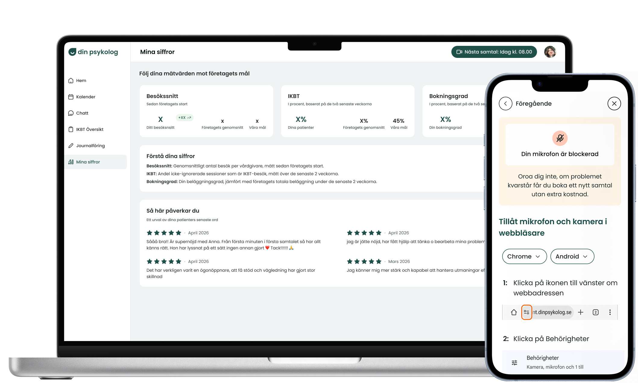
Final design
What I have done
- Project lead from research to implementation, owning the design process in an OKR-driven organization where design work is aligned to business objectives. Defined data tracking points together with the tech team and followed up on performance.
- Experimenting with AI tools for prototyping: Claude, Stitch and Cursor.
- Complete user journey mapping with data analysis and workshop facilitating to find ideas of improvement. Design of top 4 prioritized improvements.
- Analysis of data to drive design decisions, from A/B-tests, funnels, heatmaps, interviews and surveys, in collaboration with the product owner.
- Interviewing users and leading usability tests.
- Testing as a part of implementation.
- Internal presentations, info graphics, illustrations, interactive onboarding material and UX-writing.
- Design of caregiver platform: edit, delete and archive patient functionality in chat, google calendar integration and patient review visibility. Iterations of the patient and caregiver platform as well as the landing page in Figma.
Supportcenter and troubleshooting guide
Two things, shown together because they shipped together. The Support Center is the hub: one place holding every answer, reached from inside the service. The troubleshooting guide is the longest thing inside that hub and the one people reach in a hurry. Both pictures below carry both, left to right, the hub first and then the guide. What changed on the surface is one story for the two of them, so it is told once here; each then gets its own section underneath.
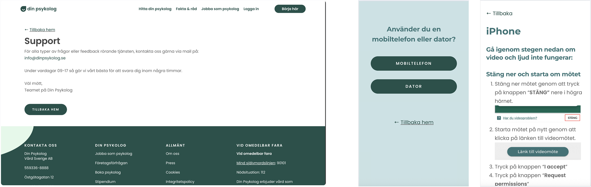
Before: the support page that stood in for the hub (left), and the device question and instructions that stood in for the guide (middle and right)
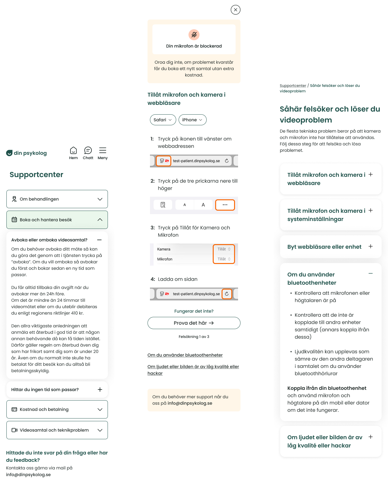
After: the Support Center (left), and the troubleshooting guide and one of its articles (middle and right)
What changed on the surface, in both
It stopped looking like a page about the product and started looking like part of it. The old support page carried the marketing site's navigation and its four-column footer, so a patient already signed in was pushed out into a different place to ask for help. It was also still on the brand the rest of the service had already moved off, which made it read as a corner nobody had been back to. The new hub sits inside the service, on the current identity, with the service's own navigation. Nothing on the screen suggests you have left.
The thing on the page changed from an address to an answer. Before, the whole page resolved to one email address and a button back to the home page. Now the answers are the content, and the email sits at the foot of the page under a line asking whether you found what you needed. It is still there for the cases the hub cannot solve; it is no longer the first and only offer.
Three screens of questions became instructions that are already there. Getting help with video used to start with a full screen asking whether you were on a phone or a computer, then another asking which one, before a single step appeared. Every tap costs time to someone who is already late for a session, and the branches had to be kept by hand, so the instructions at the end of them had drifted out of date as browsers and devices moved on. The guide now detects the browser and device and opens on the right steps, with two dropdowns sitting above them so the user can correct it when the detection is wrong. The override is there for the edge case rather than in front of everybody.
Continuous text became something you can scan. The old instructions ran as paragraphs with the names of buttons bolded inside the sentences, which asks the reader to parse a page to find their problem. The hub gives each topic its own full-width row with an icon at the start and a chevron at the end, so the eye runs down a short list of shapes instead of reading for the one line that matches. In the guide the same move is made with air and pictures: each step is separated rather than run together, and every one of them is paired with a screenshot of the thing being described.
Colour picked up a job it did not have before. The old pages used the brand green for everything that was not body text. In the new flow green stays with navigation and actions, and a warm sand panel carries the two moments where the user needs reassurance rather than instruction: the status card telling them their microphone is blocked, and the note that a missed call can be rebooked at no cost. Something being wrong now looks different from something being clickable.
Designing for accessibility. Healthcare puts accessibility requirements on the products it uses, but the stronger argument came from who these screens are for. Someone opening the Support Center is usually not browsing. They are a few minutes from a session with their psychologist and their microphone will not work. That is a bad moment to ask anyone to interpret an interface, so every decision below was about removing one more thing the user has to work out for themselves.
Support Center
Turning a single support email and scattered FAQs into one organized hub.
Benchmark before designing. Market research made the best practice clear: a single categorized hub beats FAQs spread across the product. Starting from a proven pattern, then adapting it, gave the work a solid foundation rather than a guess.
Four categories, named after the errand rather than the organisation. Om behandlingen, Boka och hantera besök, Kostnad och betalning, Videosamtal och teknikproblem. A patient arrives with an errand, not with a map of which team owns what, so each category is named in the words they would use for the thing they came to do. The split follows what the support inbox was actually being asked.
Few enough to see all at once. Four rows fit on a phone screen without scrolling, which means choosing is a glance rather than a search. That ceiling decided the grouping as much as the content did: a fifth category would have bought a finer split and cost the thing that makes the list quick, so related questions sit together under a broader name instead.
One per row, not a grid. Tiles would have sent the eye in two directions across a screen someone is reading in a hurry. A single full-width column gives one decision per line and a single direction to read in, and it keeps every label on one line at mobile width, where a two-column grid would have started wrapping the longer names.
The icon is for coming back, the chevron is for knowing what will happen. Each row carries an icon at the start and a chevron at the end. The icon gives the row a shape to recognise on a second visit, when someone half-remembers where they found the answer last time. The chevron says the row will open in place rather than take you somewhere, which matters on a screen a user reached while something was going wrong. Inside an open category the questions use plus and minus instead, so the two levels never look like the same control.
Placement is a design decision, and it should be testable.I moved the hub into the service for logged-in users instead of leaving it on the marketing site, based on a hypothesis: logged-in users need support most (invoices, rebooking), and the old flow forced them into a new tab that was hard to navigate back from. I kept a separate, new-user-focused FAQ on the landing page so each audience got content matched to its context.
Validate hypotheses with data, not belief.Working with the tech team, I set up tracking on where users entered the support center from. A month after launch, the in-service entry point was a clear majority, confirming the placement decision and the assumption behind it. Closing the loop with measurement is what turned a reasonable guess into a defensible decision.
Accessibility. State that is readable without color. In the Support Center the selected category is marked with a color change, and the contrast between the selected and unselected state does not meet WCAG 1.4.3. I could not fix that with color alone, so I made sure the state was carried by three other things: the chevron rotates to point down, the questions for that category expand underneath it, and any previously open category collapses. The selected state is legible even if the color difference is invisible to you, which is what WCAG 1.4.1 asks for.
I would rather have solved it properly. The design system I was working in is built on light colors and a light mode only, and it did not contain a selected state with sufficient contrast. I prototyped one using the dark green with white text, which would have passed comfortably, but the dark green already carried a different meaning across the platform and using it here was voted down as inconsistent. That was a fair call for the product as a whole, and it left a gap in the system rather than in this screen.
If I were continuing the work, this is what I would push for first: a defined selected state in the design system that meets contrast requirements, rather than every designer solving it locally.
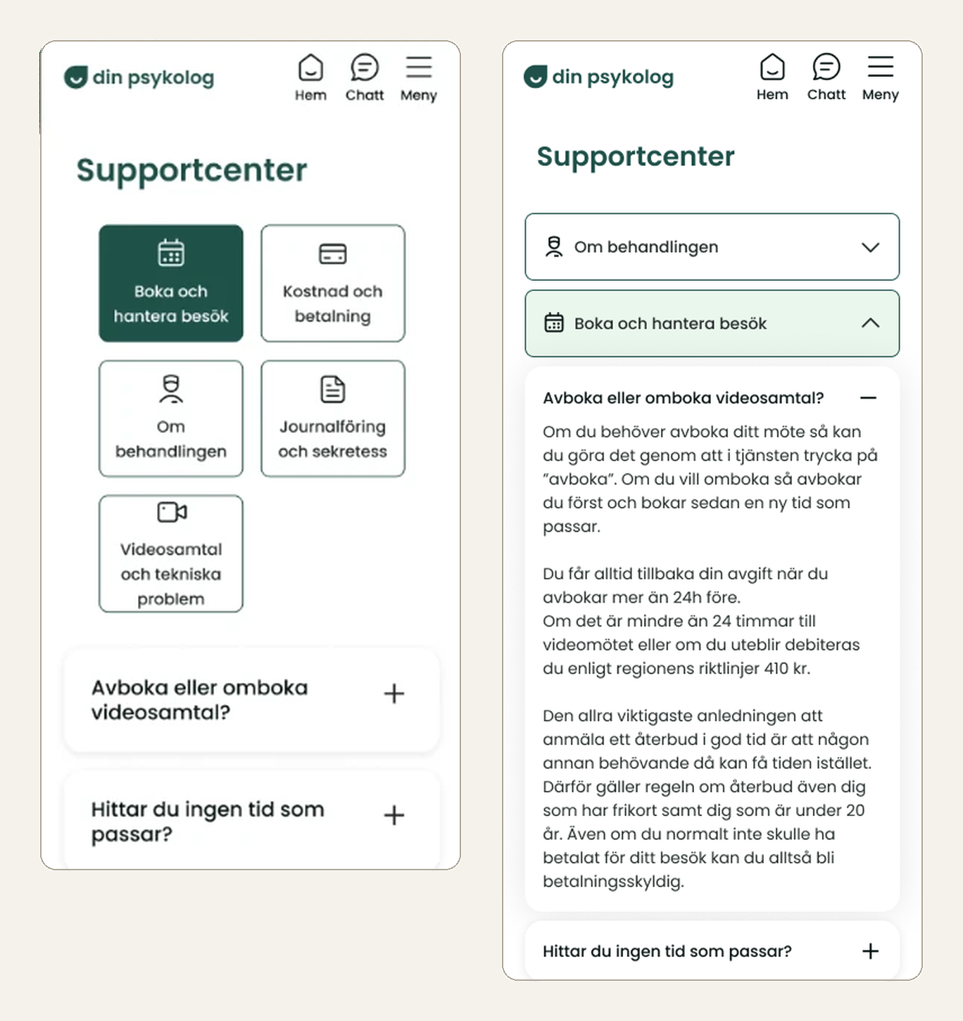
The alternative, with the categories as cards and the selected one in dark green (left), and the version that shipped (right)
Troubleshooting Guide
Helping patients recover from camera and microphone issues before a video appointment.
Design for the emotional state, not just the task. Users hit this guide moments before (or during) a missed appointment, stressed and time-pressured. That reality shaped every decision: short steps, one clear action at a time, and reassurance up front that a missed call could be rebooked at no extra cost. Lowering anxiety was as important as solving the technical problem.
Remove every decision the system can make for the user. Instead of asking people to identify their browser and device while panicking, the guide detects what's blocked, which browser, and which device automatically, and surfaces the right instructions immediately. Manual override stayed available for the edge cases where detection is wrong, but it's never the default path.
Let research set the hierarchy. Rather than listing every possible issue equally, I leaned on existing interviews, survey data, and the tech team's input to learn that camera/mic permissions were by far the most common failure. The most frequent and fastest-to-solve problems lead; Wi-Fi and audio-quality issues sit lower as secondary links. Ordering by real frequency is what makes a guide feel effortless.
Progressive disclosure keeps a stressful flow calm. Steps reveal one at a time: browser permissions first, then device settings, then restart or try another device, with a large CTA moving the user forward only if the previous step failed. Pairing each step with a screenshot and an orange highlight on exactly where to click removed ambiguity.
Sand already meant "nothing for you to do here". The design system used the sand panel for information the user cannot act on, so I used it the same way rather than inventing a treatment for this screen. It does two things at the top of the guide: it is the one block that does not look like the rest of the page, so it takes the attention first, and what it says when it gets that attention is that a missed call can be rebooked at no cost. The loudest thing on a screen someone reaches in a panic should be the sentence that calms them down.
Felsökning 1 av 3 says the end exists. A counter on a troubleshooting flow is not about position, it is about scope. It tells the user there is more coming if this does not work, and more importantly that there are three things to try rather than an unknown number. Knowing the list is finite is what stops someone giving up on the first one.
The way out is deliberately not the primary button. At the foot of each attempt sits "Fungerar det inte?" and a large "Prova det här" button. It had to be big and unmissable for someone who has worked all the way down and is still stuck. It is in the secondary colour rather than the primary green because a stressed user reaches for the brightest thing on the screen, and if that were the skip button they would press it before trying the steps. The label does the same work: "Prova det här" offers an alternative, where "Nästa" would have implied the steps were something to get through.
What research said was rare is styled to look rare. Bluetooth problems and poor audio or video quality came up far less often than permissions, so they sit below the button as plain links rather than as steps or cards, and the sand panel with the support address sits below those. Everything on the screen is reachable; how much weight each thing carries is set by how many people actually need it.
Accessibility. Screenshots with the target marked. The troubleshooting guide shows a picture of each step with an orange square around exactly where to press. This is not a formal requirement anywhere, and I included it because the requirements are a floor rather than a goal. Written instructions assume you can hold a sequence in your head and map it onto your own screen. If you are stressed, or tired, or simply not confident with the device, that assumption breaks first. Showing the target instead of describing it removes the step where things usually go wrong.
Constraints are part of the brief.Because the service runs on web rather than a native app, permissions behave inconsistently (sometimes in-browser, sometimes in device settings). Designing within that limitation, and making the inconsistency invisible to the user, was the core challenge.
Accessibility. Icons always carry text. Categories are labeled, not just illustrated, and status messages like "Din mikrofon är blockerad" pair the icon with the sentence. An icon on its own asks the user to already know what it means, and someone using a screen reader gets nothing from it at all.
Accessibility. Links you can see without color. Links are underlined rather than only colored, so they are distinguishable to someone who does not perceive the color difference.
Caregiver platform designs
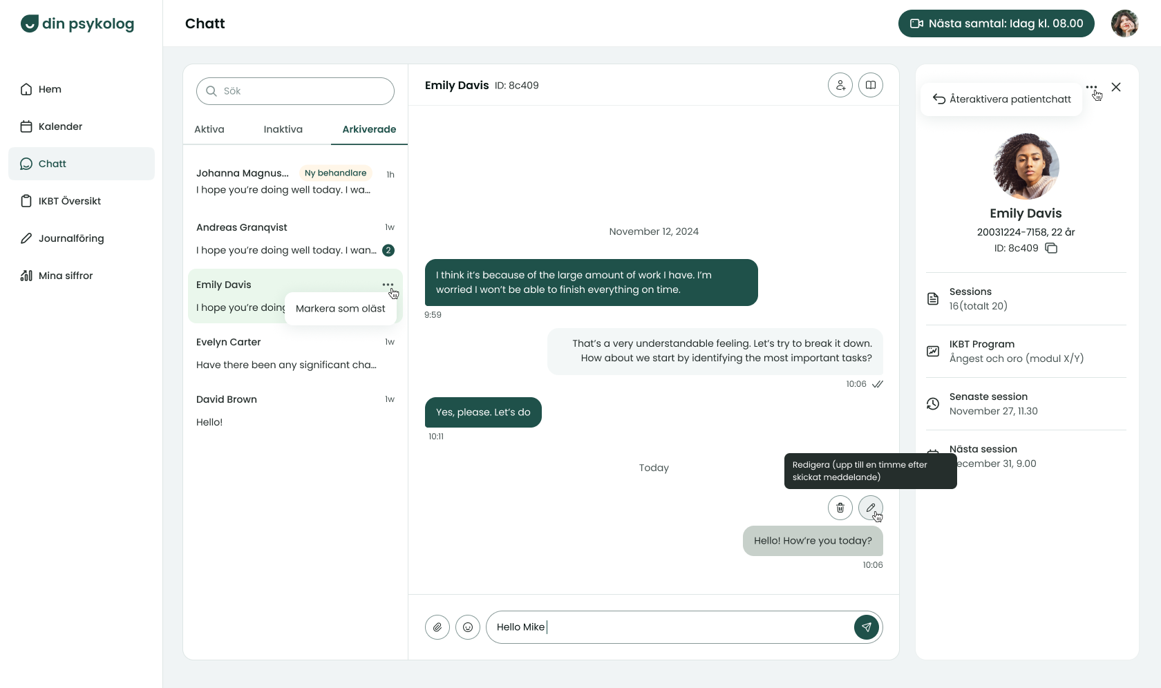
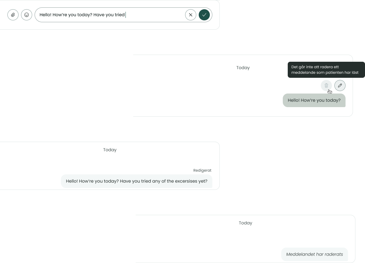
Editing, deleting and archiving in the caregiver platform
Giving caregivers safer, more flexible tools to manage many patient conversations.
Balance user flexibility against patient safety with clear constraints. Caregivers wanted to fix or remove messages sent in error, but unrestricted editing is risky for patients. The compromise: messages stay editable/deletable for one hour, deletion is blocked once the patient has read the message, and tooltips explain these limits before the user acts. The constraint is the safety mechanism.
Borrow mental models people already trust. Marking edited or removed messages with "Redigerad" or a deletion notice follows familiar messaging conventions (e.g. Messenger), so caregivers and patients understood the behavior instantly, with no learning curve and full transparency about what changed.
Design for the real workflow.Caregivers juggle many patients, so I added "mark as unread" after feedback that they sometimes open the wrong patient's message and lose their place. Small affordances that match how people actually work often matter more than big features.
Better structure can be its own feature.The archive function, a dedicated tab in the chat list plus an archive action on the patient profile, solved an information-architecture problem: previously every "inactive" patient (whether inactive two weeks or several months) lived in one undifferentiated tab. Letting caregivers archive patients who are "lost" per routine restored a meaningful, manageable structure.
The controls appear on hover, and only while they still work. Putting an edit and a delete icon on every message would fill a conversation with symbols that are mostly not wanted. They surface on the message you are pointing at instead, and they are only drawn while the action is still available, so the interface never offers something it is about to refuse. A caregiver reading a thread sees a conversation; a caregiver fixing a mistake sees the tools.
Above the message rather than beside it. Beside the bubble looks like the easier placement until you notice the bubble has no fixed width. It is sized by the message, so a short one on a desktop leaves nothing to sit next to, and a long one on a phone has already taken the room. The same controls either squeeze the text or push past the edge, at both ends of the range. Above the message is the one position that holds whatever the message is and whatever the screen is. The phone is what made me look: caregivers do their work on a desktop, but they check in from a phone in the morning and the evening, and a control that only behaves on the larger screen is not finished.
Borrowed from the tool they already had open, but legible without it. At the time most patient communication ran through Braive, so the editing and deleting patterns follow what caregivers were already doing there rather than asking them to learn a second set. The test I held it to was whether a caregiver who had never seen Braive would still read it correctly, because a convention borrowed from one product is only a shortcut for the people who know that product.
The tooltip carries the rule, not just the name. Hovering an icon could have said "edit" and "delete", which the icons already say. Instead it says how long editing stays open, and that deleting stops being possible once the patient has read the message. Putting the constraint in the tooltip means the caregiver meets it before they act rather than after, which is the difference between a rule and a rejection.
Editing happens in the composer, not on top of it. The message input is replaced by the edit field rather than a modal or an overlay opening over the thread, which keeps the screen as calm as it was a moment ago. The message being edited stays marked so the connection between the field and the message is visible, and the send icon becomes a cross and a check: back out, or commit. Both are conventions from the editing patterns people already use elsewhere.
States say what is no longer possible. Once a patient has read a message, delete goes to the design system's disabled state while edit stays live, because the one-hour window has not closed. After the fact, an edited message carries "Redigerad" above it and a deleted one leaves a line of italics where it used to be. Both of those came straight from how messaging apps already mark the same events, so neither needs explaining.
5-Star Reviews on the Caregiver Page
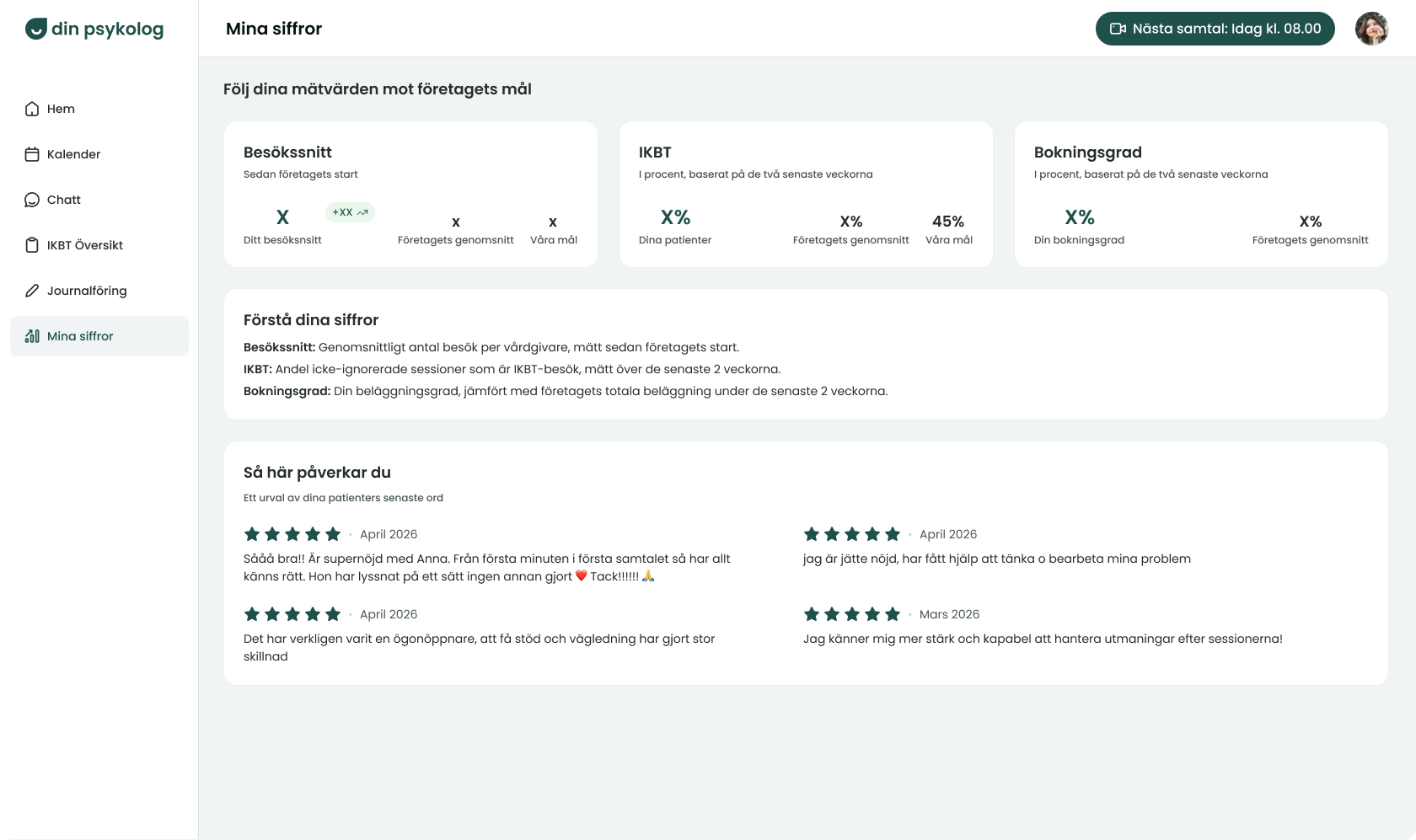
With reviews
Empty state
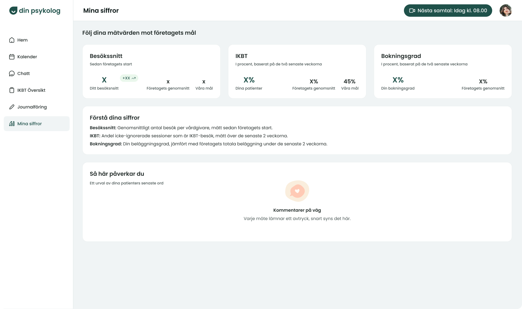
Edge cases and empty states are part of the happy path. I designed the logic to look back up to three months when the latest month has no 5-star reviews, plus a dedicated empty state for caregivers (often new ones) with none yet. Planning for "what if there's no data" up front kept the feature from feeling broken for the people who need encouragement most.
Protect privacy even in positive features. Because the reviews are anonymous, I showed only month and year rather than exact dates, removing a detail that could help identify a patient. Safety considerations don't pause for feel-good features.
Emotional design can serve a real goal. A motivating title ("Såhär påverkar du") and visible star ratings were intentional choices to show caregivers their impact and reinforce the behavior. Design in service of motivation, not just information.
The stars stay stars, in the colour that carries furthest. Only four and five star reviews ever reach this page, so the rating could have been a line of text and lost nothing in information. It would have lost the thing the feature is for. A row of filled stars is read before it is understood, and reading it is what gives the lift; a sentence saying the same thing has to be processed first. They are set in the primary dark green so they are the first thing the eye lands on.
The empty state encourages rather than explains. A caregiver with no reviews yet is usually a new one, which is exactly who can least afford a screen that reads as nothing here. The icon is a heart inside a speech bubble, because what is missing is not data but something a patient said. The copy says the comments are on their way, that every meeting leaves an impression, and that they will show up here, so the screen is about what is coming rather than about what is absent.
Reflection
The clearest signal came from the Support Center placement. A month after launch, tracking showed that the in-service entry point was used by a clear majority, confirming the hypothesis behind moving the hub out of the marketing site and into the service.
What I would follow up on is whether the troubleshooting guide actually reduces missed appointments, and how well the automatic detection holds up across the full range of browsers and devices in the wild. That is the part of the design leaning hardest on assumptions I was not able to test in full.