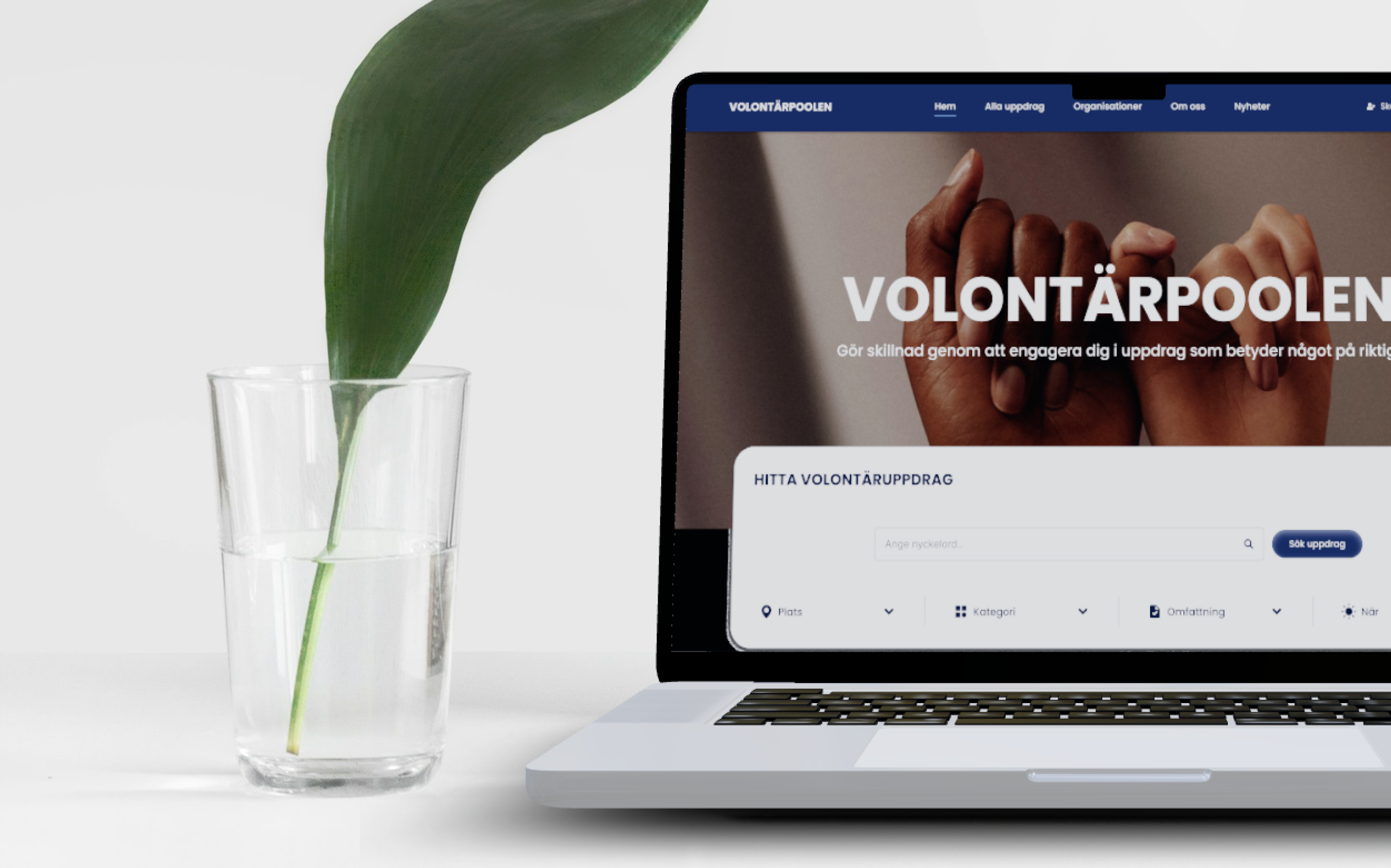
Flora
Responsive website for a flower shop with a subscription business model.
Context
A course project in a team of two, with eight weeks to take a self-chosen problem through to a responsive design and a full visual identity.
Goal
To design a solution to a problem for a specific target group and create a fitting visual identity.
My role
UX-designer. I worked across the whole project: research, the visual identity, the UI and the design system.
Result
A responsive website design with a complete visual identity and design system. The WCAG contrast check decided which color combinations could carry text and controls, and the round of user tests reshaped the basket: a back button and quantity controls were added, the "keep shopping" button was dropped, and the add button and price swapped places to make the button easier to hit.
Duration
8 weeks
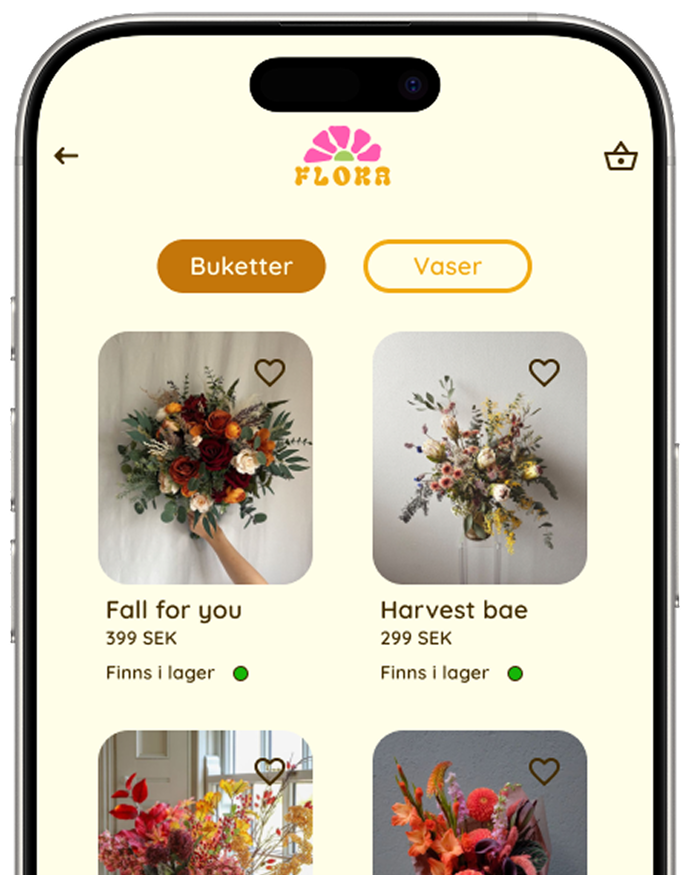
Final design
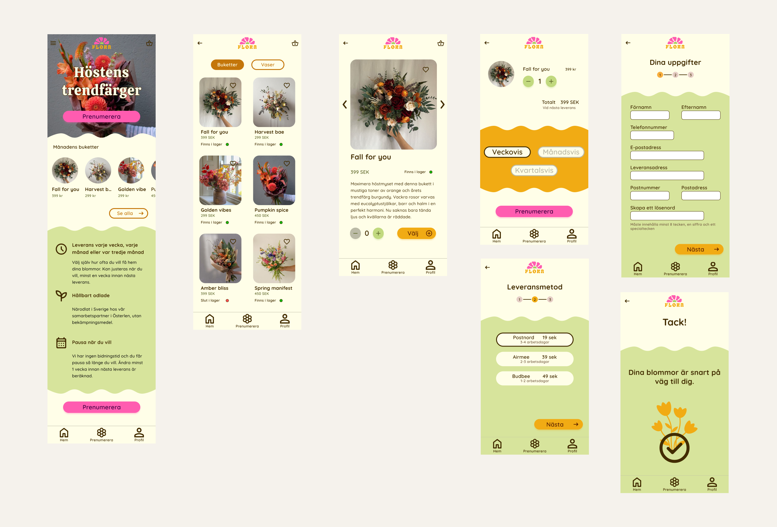
The flow, from the start page through to confirmation
Design system
Everything on screen is built from one set of parts, and the sheet below is read straight out of the prototype's own stylesheet rather than drawn next to it. Three brand colours, two typefaces, one button family, and the small pieces the screens are assembled from.
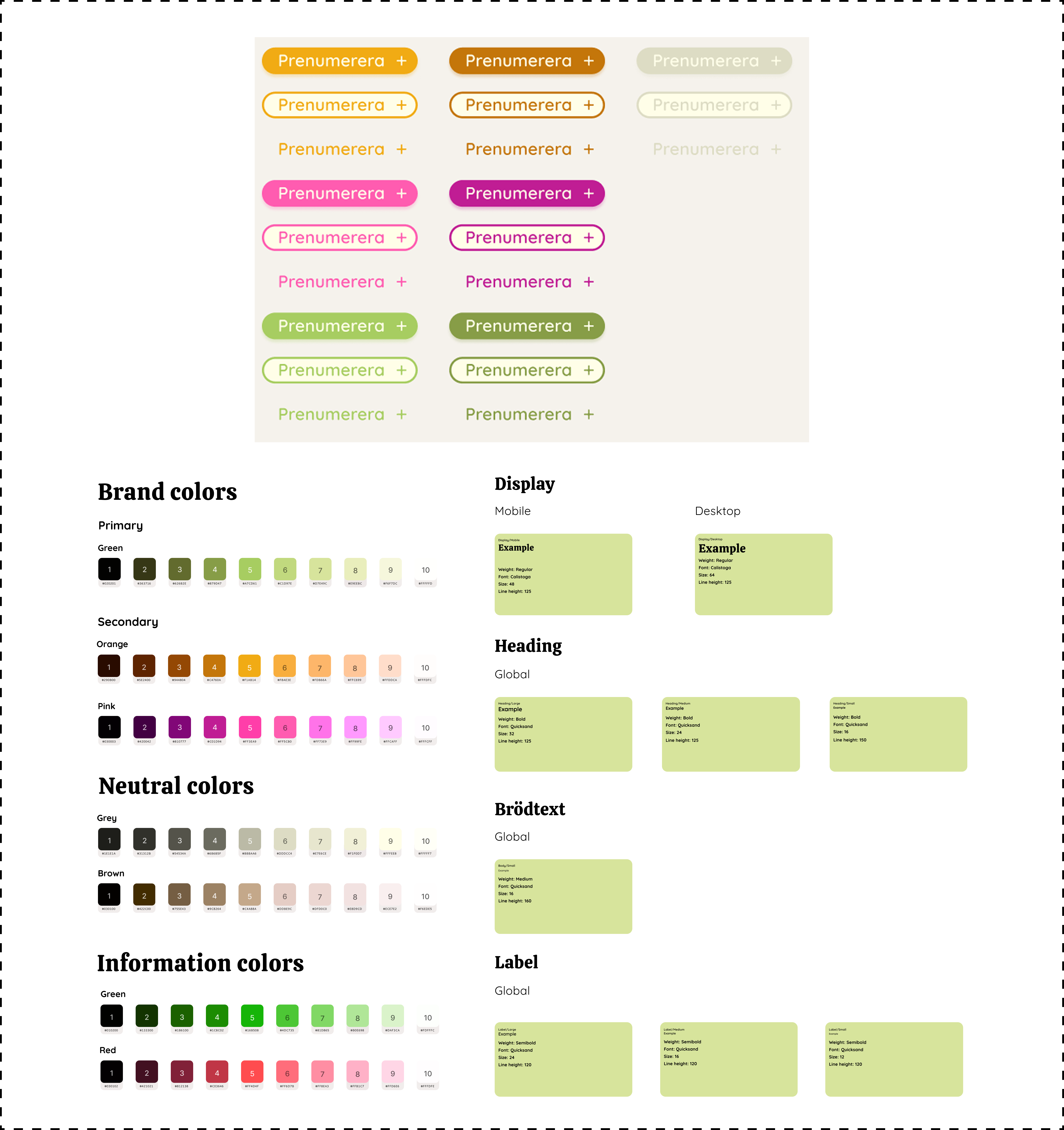
The system the prototype runs on
A colourful brand needs more rules than a restrained one. Three brand colours gave us the playfulness we were after, and they also give every new screen three ways to drift out of step with the rest. Putting the components in one place is what kept the palette consistent once there were more screens than we could hold in our heads.
Each colour has a job, matched to how often you meet it. Pink belongs to the subscribe button, the action the whole business model rests on, so it gets the colour that pulls hardest. Orange carries the things that come round constantly, the next step and the selected interval, so it had to be easy to find without demanding attention every time. Green is the calm backdrop the promises and the forms sit on, never an action.
Only one of them is allowed to be the focus ring. Fields take an orange ring, everything else takes pink, and nothing else in the interface uses a three-pixel outline. That is the rule that makes the ring readable as a ring rather than as decoration, and it is the one piece of the system that exists purely for people who are not using a mouse.
States were settled before they were needed. Every button has its hover, focus and disabled variant in the system, so a screen never has to invent one. Settling a shade in advance is easier than picking whatever happens to look right on the screen in front of you halfway through a build, and the disabled button in particular is the one that gets invented badly under pressure.
Visual identity
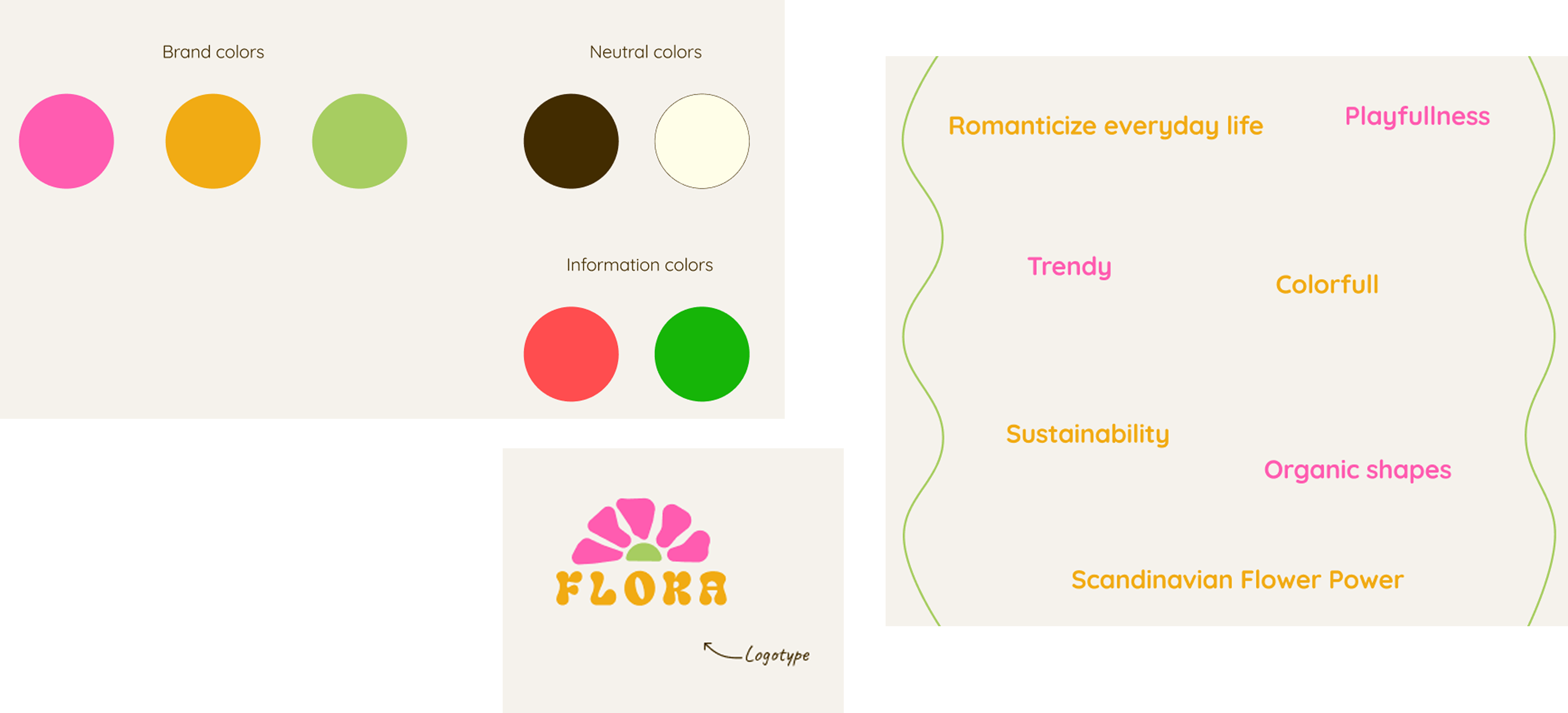
Brand colors, logotype and the words that guided the identity
Text and typography
The font of the logo is inspired by nature's own forms, creating an organic, soft and modern impression that evokes connotations of playfulness and joy.
The primary font in the interface is a rounded sans serif, providing a modern feel. Additionally, there is another font used for headings, a serif that contrasts with the main font. Despite its more sophisticated style, it still conveys a playful and friendly vibe.
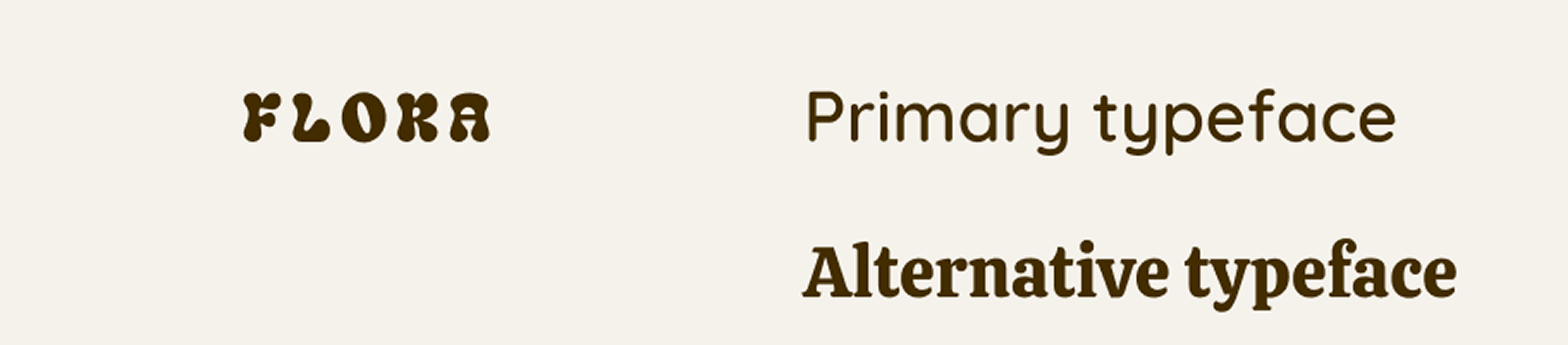
Logotype, primary typeface and alternative typeface
Design language and logo
Similar to the wordmark of the logo, the symbol is inspired by nature with its soft, blurred form. The symbol depicts a half-flower placed above the wordmark, resembling a sunrise. The flower is not realistically depicted but has an abstract, modern touch in its design. Together, they form a logo that evokes the feeling of contemporary Scandinavian flower power.
Icons and other vector graphics feature rounded shapes with a "semibold weight" to complement the overall design language and typography, giving a modern and friendly feel.

The flower symbol and an icon in the same rounded style
The Process
Our target group was young adults interested in interior design and the latest trends, as well as conscious about climate change.
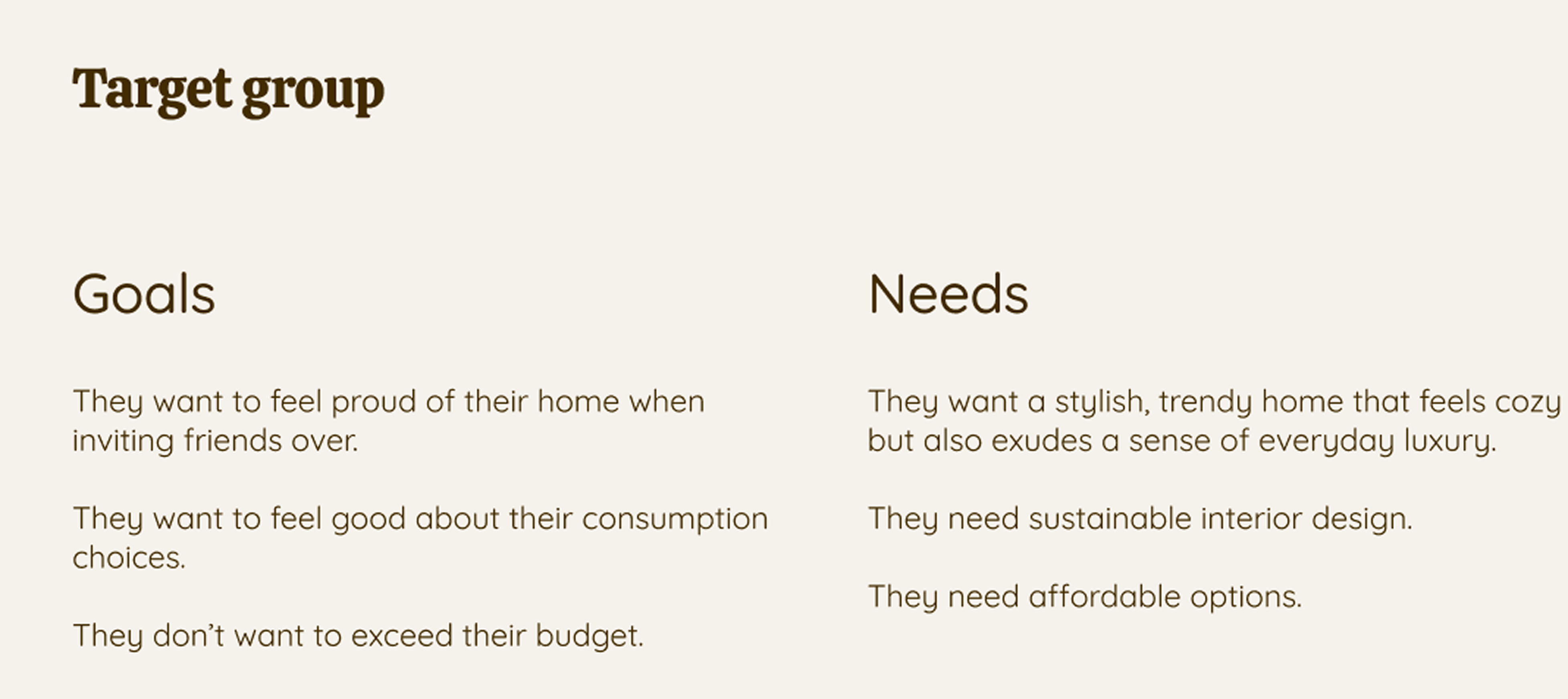
Target group
Playfulness was the gap in the market. We had noticed that most flower shops had an elegant sophisticated aesthetic to them, while the obvious connection between a colorful bouquet and youthful playfulness was overlooked. We wanted to use that to stand out from the crowd and use the trends of organic graphic forms to appeal to our target group.
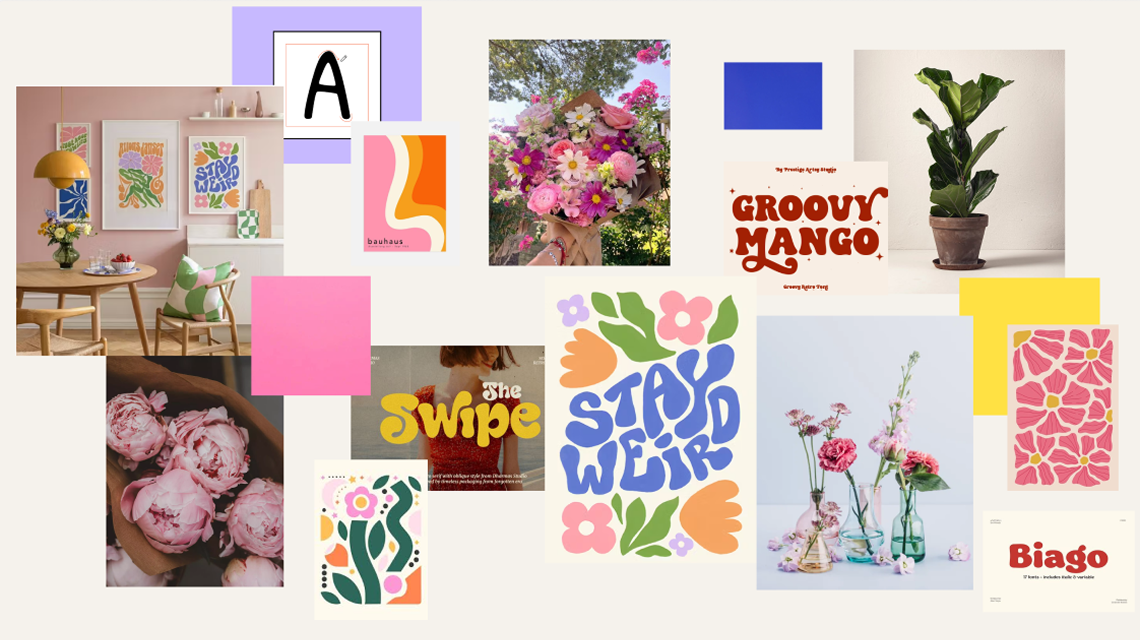
Moodboard
Photography with a Pinterest feel. The photography was chosen for a modern, Pinterest-like aesthetic, to match the way our target group already browses for interior and styling inspiration.
Balancing modern and retro in the logo. We wanted the logo to balance the modern and the retro touch perfectly and started with testing several fonts and playing around with distortion of the font to add an abstract feel to it. At this point the name for the company was not chosen, so we used the working-name of Anna. We iterated different designs of a flower, with one being too retro and the other one being too scandinavian modest. We then designed the "half-flower" that had the balance we were looking for. The idea was a colorful logo to bring out the playfulness so we tested different color combinations from the vision board. We chose the one that balanced best: the blue came out far too strong, and the version with purple on the leaves read more feminine than we were after. What settled it was that these colors sit where a real flower would not have them, with no yellow at the center, which holds on to the abstract feeling the distorted wordmark was already reaching for and gives the mark a little more edge.
Enough colors to feel playful, few enough to recognize. We struggled for some time with the idea of how many colors to include in the brand. Many enough to convey the playful feeling of a colorful bouquet, but few enough to create a strong recognizable brand. We decided on three brand colors and two neutrals. The brand colors (pink, orange and green) were chosen to emphasize playfulness, joy, innocence, and energy, while also reflecting a connection to nature. The neutral tones are earthy, aligning well with the industry the company operates in.
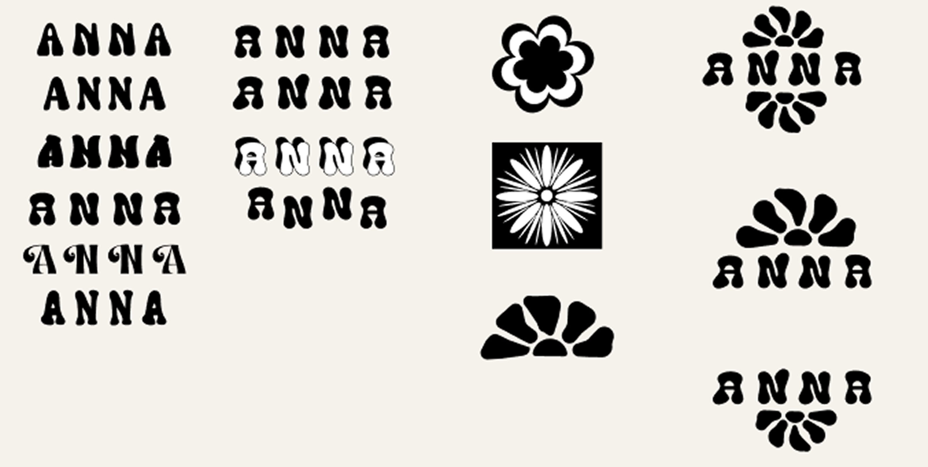
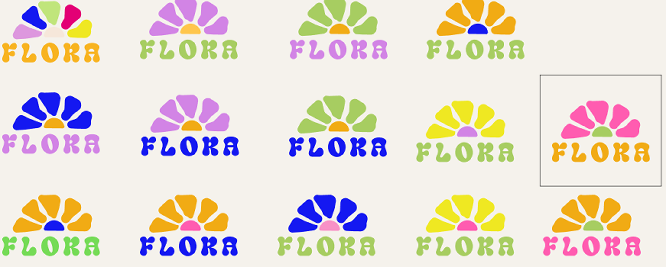
Logo iterations
Contrast checked before the colors were locked in. To make sure we followed the guidelines of WCAG regarding accessibility we did a contrast-check of all the color combinations. This was used as a basis for decision-making of which colors and combinations to use on the most critical parts where perception is paramount. The check showed each of the three brand colors falling short against the light neutral, so buttons and text take a darker step from those color scales instead. The decorative areas kept the original shades: the wavy orange background, the green fields and the orange inside the logo carry no information that contrast rules exist to protect, and the logo letterforms are thick and large enough to hold up on their own. Darkening those areas would only have made the whole page heavier to look at without helping anyone read it.
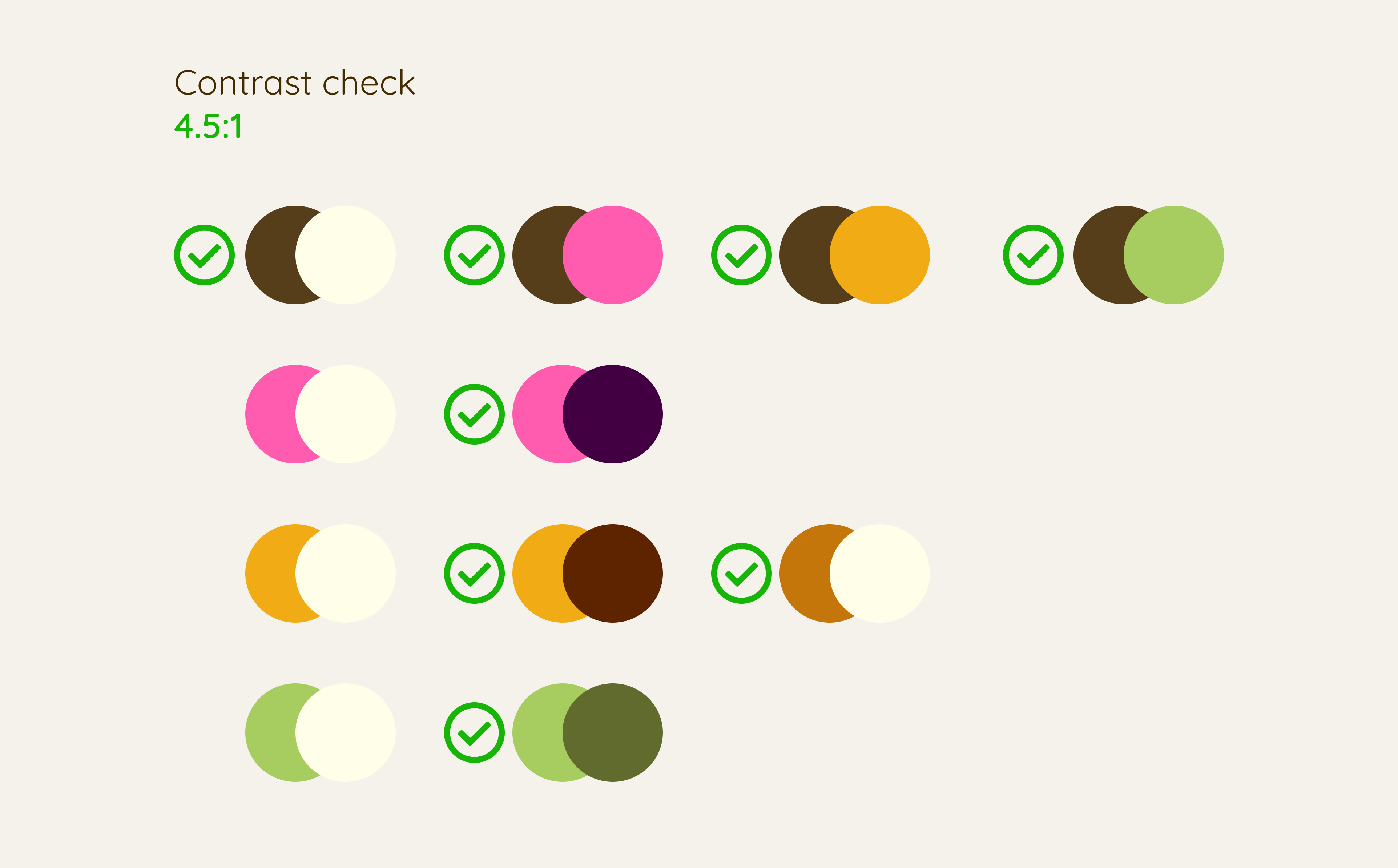
Every pair checked against 4.5:1, with the ones that pass marked
Accessibility. Status you can read in greyscale. Stock status is written out as "Finns i lager" or "Slut i lager", rather than shown only as a red or green dot. A dot on its own puts the entire message in the color, which is hard to tell apart in greyscale and for anyone who does not separate red from green.
Accessibility. Icons carry a label. The icons in the tab bar are written out rather than left to speak for themselves. A house or a cart is understood almost anywhere, but the flower standing for the subscription is not a convention anyone has learned, so on its own it would be a guess.
From architecture to Crazy 8 sketches. We started by sketching a rough architecture of the app and then defined the user's subgoals for each screen, as well as the company's objectives for the same. With this in mind, along with research on best practices, we created several low-fidelity design sketches using the Crazy 8 method.
Testing the layout before committing to it. In our med-fi wireframes we tested the visual language in the layout by combining ideas from the low-fidelity sketches. We conducted "user tests" with our sync group and made further adjustments based on the feedback we received. Finally, we used these iterations to test the colors in the user interface. The findings included adding a back-button and a add and subtract button in the basket, as well as to remove the "keep shopping"-button since we now have the back-button. It also came to light that the add-button and the price could switch place to make it easier for the user to click the button.
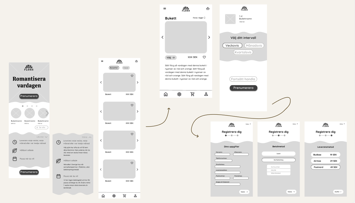
Mid-fi wireframes after the round of feedback
Reflection
The decision I would revisit is the number of brand colors. Three brand colors and two neutrals gave us the playfulness we wanted, but keeping a palette that colorful consistent across a whole site took more rules than we had time to write. With another round I would define clearer guidance for when each color is allowed to lead.
Accessibility. The habit I took with me. Working with the WCAG contrast check as a decision-making tool rather than a final check is the habit I took with me from this project. It shaped which combinations we could use where, instead of forcing us to fix contrast after the fact.
Accessibility. Some things I would keep working on. The hearts on top of some of the pictures are hard to make out against the image behind them, and the disabled buttons do not reach a contrast of 4.5:1. The "Månadsvis" option is one example. WCAG does not actually require disabled controls to meet that, but it is still something to strive for. With another round I would also adjust the tones of the brand colors themselves, so that more combinations meet the contrast requirements and the palette can be used in more places across the interface. Beyond the colors, the next steps would be focus states, a deliberate tabbing order, error messages, and testing how the interface can be navigated and used when it is heavily zoomed in.