Hormona
Case study to improve the experience of Hormona - an existing hormone and menstrual cycle tracker.
Goal
To enhance the experience of the logging of cycle and symptoms, and make the personalized insights easier to understand.
To convert users from only using the app to buying or subscribing to hormone-tests.
To position the app on the market as the obvious choice for the health conscious woman and sell hormone tests.
Context
This was made as a part of a case study where an app of your own choosing was to be improved. The case included information about the app, the issue it solves and background, its target group, goals, usage problems and the design of improvements. Due to the short time span no user testing was made.
My role
UX-designer. I did the case on my own, from the research and the usage issues to the sketches and the design of the improvements.
Duration
1 week
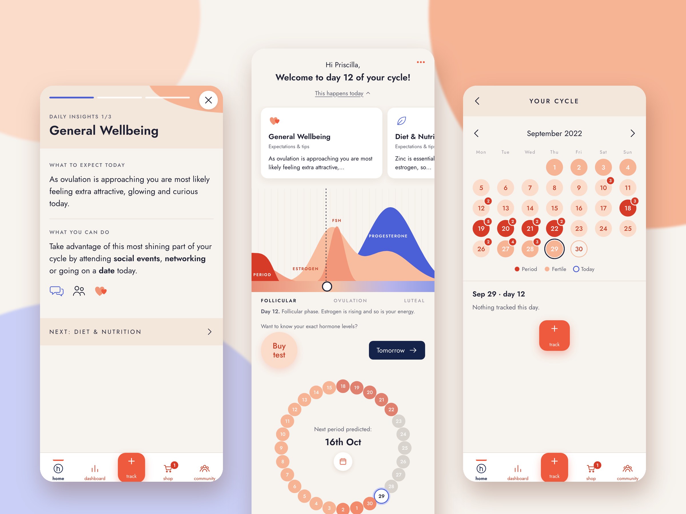
The new Hormona, as a working prototype
Background
Hormona is an app for tracking hormone levels, with several features:
- Daily logging of periods and symptoms (such as acne, headaches)
- Personalized insights and advice on lifestyle changes (including diet, exercise, and sleep)
- Hormone testing for home delivery, integrated with the app, providing a more accurate picture of hormone levels
Target group
Women, 20-50 years old with an interest in health.
The menstrual cycle is a woman's fifth vital sign
More and more women are experiencing issues related to hormonal imbalance. This can range from diagnoses like PCOS to milder symptoms. At the same time, the number of involuntarily childless individuals is rising, making menstrual cycle tracking an increasingly important part of pregnancy planning today. For those who do not wish to become pregnant, hormone-free contraceptives have become the new trend. This is why I chose to narrow the target group to women aged 20–50, even though the range of women in their fertile years is broader. The assumption is that issues with hormonal imbalance are often identified after the teenage years or later, and that family planning typically occurs later in life. I also believe the target group has a general interest in health, including diet, exercise, and mental well-being, which may lead them to discover this service. Alternatively, using the service itself might spark a broader interest in health and wellness.
Targets
Experience GoalsTo enhance the experience of the logging of cycle and symptoms, and make the personalized insights easier to understand.
Conversion GoalsTo convert users from only using the app to buying or subscribing to hormone-tests.
Business GoalsTo position the app on the market as the obvious choice for the health conscious woman and sell hormone tests.
Usage issues
Problem
The biggest issues included a weekly overview that didn't serve a purpose, too much text that made it difficult to get an overview of the insights and quickly absorb the information. Too discreet CTA-buttons and content at the wrong place.
Design solution
Core features gathered on the home screen, faster logging, visual aids, and a design that encourages purchases.


Before: the original Hormona screens
New Hormona
The biggest improvements
The biggest improvements include a circular overview that corresponds with best practice that is placed on the homepage, as well as prediction of the next menstruation. More detailed insights hidden and can be revealed by discreet CTA-buttons, and usage of bold text and icons to make the information more easy-to-read. A button for viewing the insights of the next day, for those that don't have time or simply prefers to prepare the night before. A new section for purchasing and CTA-buttons leading there.
The home screen and the insights
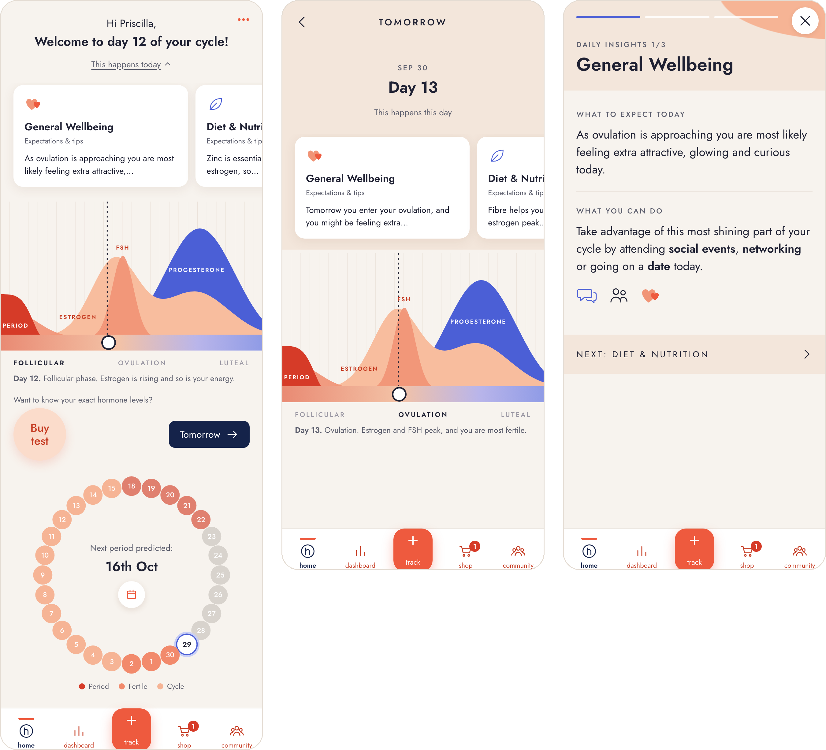
The insights fold away
The insights used to take up most of the home screen. They are useful for someone who wants to go deeper, but they pushed everything else down.
Now a button, "This happens today", shows or hides them, so they do not take up too much room on the home screen. The cards show only the start of each insight, and the details are revealed when you open one.
Bold text and icons make an insight quick to read
The old insights were informative, but hard to get an overview of and take in quickly. The most important words are now set in bold and supported by icons, so the information is easier to absorb at a glance.
Each insight is split into what to expect and what you can do, and a button at the bottom leads on to the next one.
Tomorrow, for those who read ahead
A button shows the hormone levels and insights for the next day. It is for those who do not have time to read in the morning, or simply prefer to read them in the evening, perhaps when they log their symptoms for the day.
The whole cycle as a ring on the home screen
The overview moves to the home screen, because it has more value there than the daily quiz or Ask Hormona. The quiz moves to the community, and Ask Hormona is placed under the menu.
Instead of a weekly overview, which had no clear purpose, it is an overview of the whole predicted cycle, in the form of a circle as a visual aid. The circle is common in several period apps and therefore familiar to most users.
The predicted first day of the next period is in the middle, since it can be important when planning the days ahead. The regular calendar is reached through the calendar button in the middle.
Buy test leads straight to the shop
The old call to action for the hormone test was too discreet and easy to miss. Buy test now sits on the home screen, next to the question of whether you want to know your exact hormone levels, and leads straight to the new shop tab to encourage buying a hormone test.
Tracking, the dashboard, the shop and the community
Track opens straight on the log
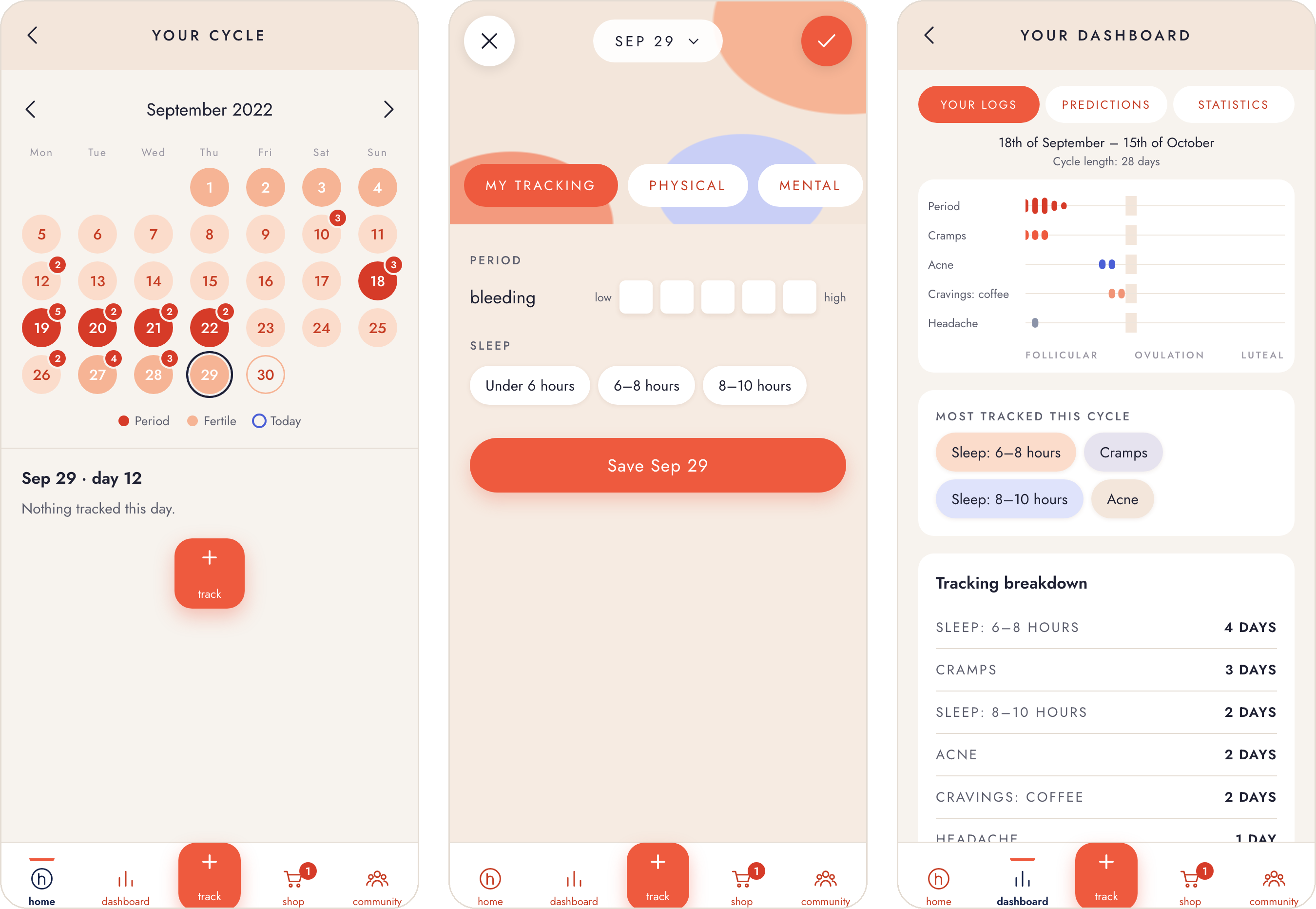
In the old app, Track looked like a button rather than a tab, and people expected it to take them straight to logging their period and symptoms. Instead it opened an overview, and there were several different modes for similar things that were easy to mix up.
Now pressing Track leads straight to the log, where both the period and symptoms can be logged in one place.
A calendar with a track button people recognise
The calendar view shows the period, the tracked days and today, and has the same track button as everywhere else in the app, so it is recognised straight away.
What is used most comes first on the dashboard
The old dashboard held useful information, for example for a visit to the doctor or a gynaecologist, but not information you need very often. Predictions sat among the statistics, where they did not belong.
Now what is used more often gets priority on the dashboard, predictions have a tab of their own, and the overview of the amount of bleeding moves under the statistics.
The hormone test can be bought in the app
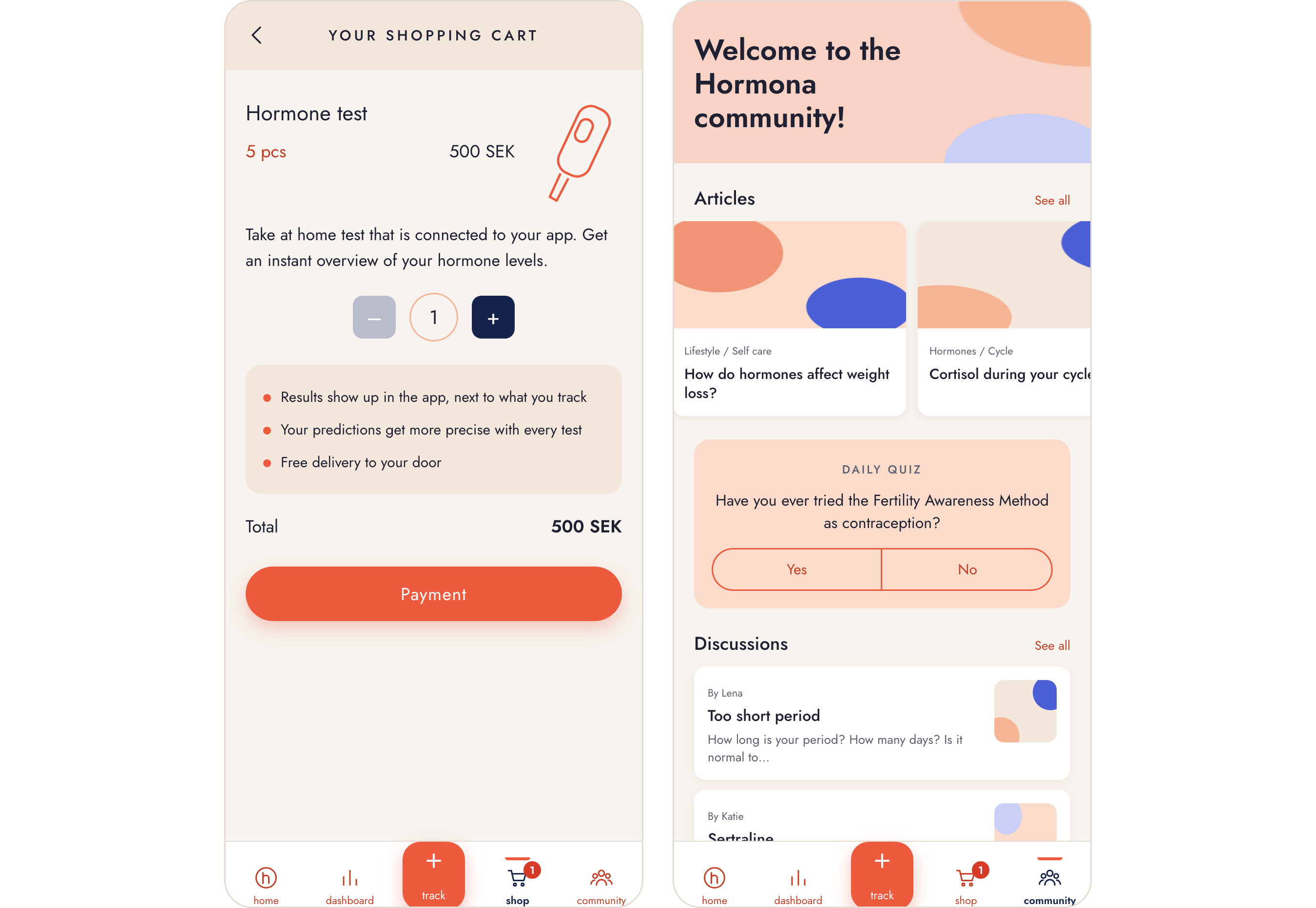
To make buying a hormone test easier, it can now be done directly in the app, in a shop tab of its own.
The daily quiz moves to the community
The quiz is moved here from the home screen, where it took the place of the cycle overview. In the community it sits with the articles and discussions, among the other things you come to read and take part in.
Market research
The circular overview corresponds with best practice. It is common in several period apps, and therefore familiar to most users.
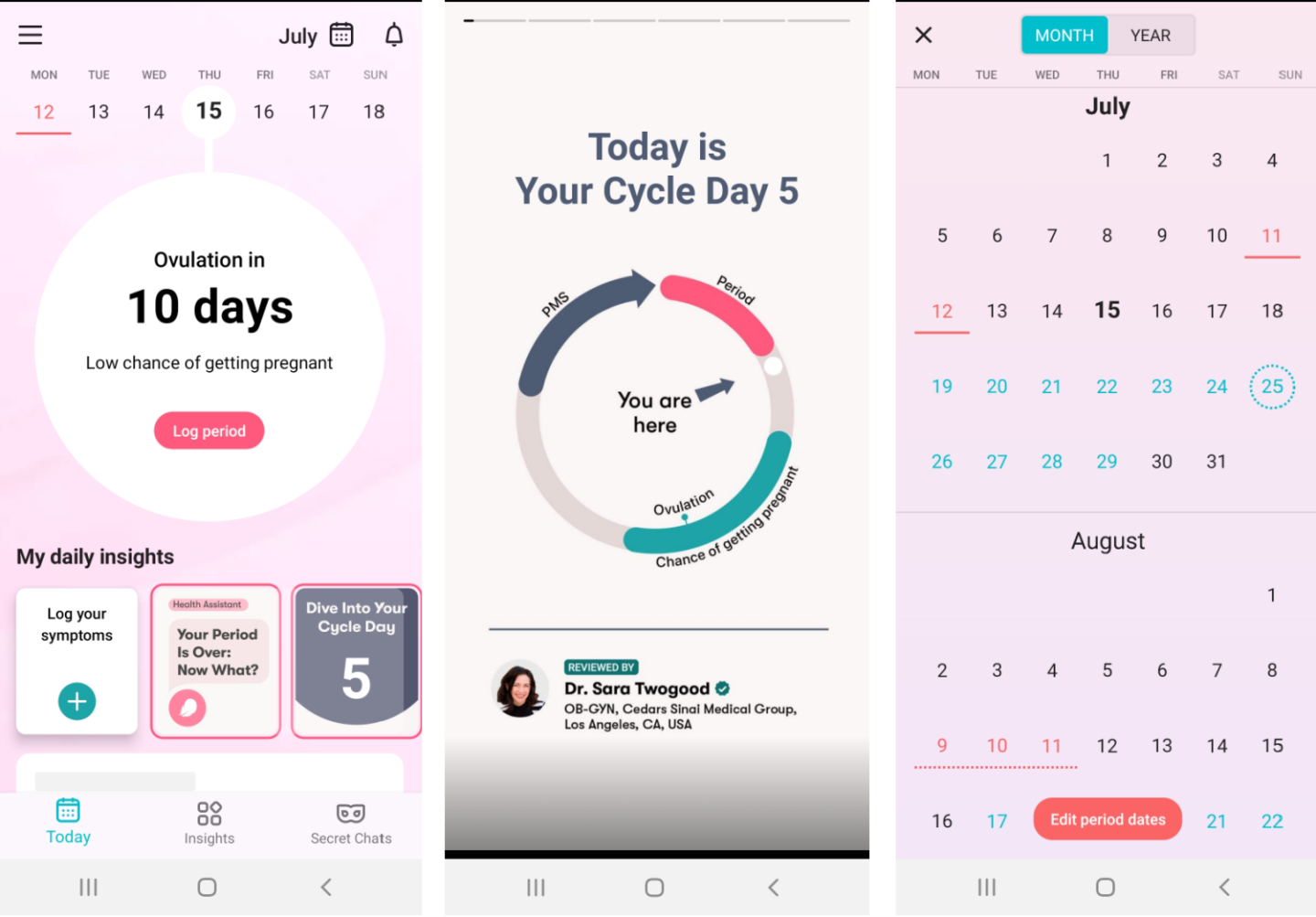
Flo: the cycle as a ring, with where you are in it
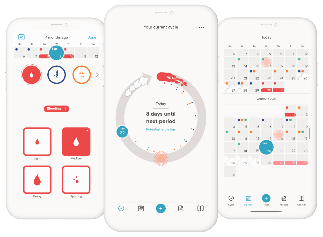
Clue: the days until the next period in the middle of the ring
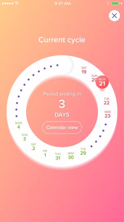
Eve: a ring of days with a button to the calendar view