Travel planner
A re-design of Stockholms official public transport app, specifically the user flow of planning a trip.
Goal
To design an easy and intuitive travel planner for public transport in Stockholm
Context
To build on what I learned from my first UX-project I wanted to:
- Test a shorter process to get richer insights from each
observation
- Take more detailed notes of every step of my process and the
thoughts behind them
- Gather data from more users by using reviews on Google Play
Timeline
3 months
So, let's learn from the good and the bad
I started with benchmarking 3 travel planner apps and collecting the 100 latest reviews of each app. One of them is the offical app for the public transport in Stockholm: SL. The second app is City Mapper which is a popular travel planner that can be used all over the world. And the third one is Google Maps, which is not specifically a travel planner but has that function as well and is a widely used app.
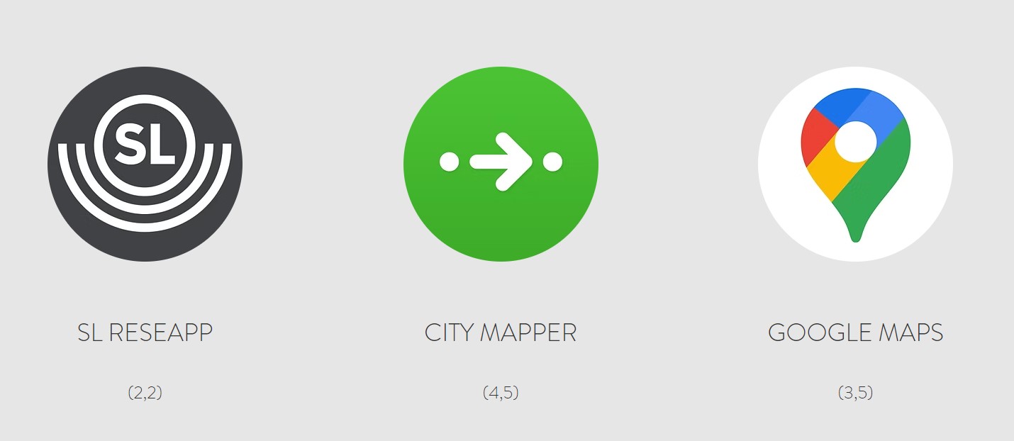
Why these?
+ 1 million downloads
To ensure that I gather helpful data I have picked apps that are
being used by a large amount of people
High and low ratings
I want to learn which pitfalls to avoid as well as which best
practices there are
Can be used in Stockholm
Since the usability testings will take place in Stockholm, they need
to function in this area
The most important findings from benchmarking:
-
Conventions
-
Best practice
-
Pitfalls
And what do the users think? Well, most reviews were bad ones. But that is to be expected. After all, most times when people take the time to leave a review it is because they are unhappy about something. And usually those are the reviews the helps improve the product the most!

The 100 latest reviews of each app was collected and then divided into 2 groups. Constructive/relevant and unconstructive/irrelevant. A review just saying "Great!" or "Horrible!" for example is not that helpful. The constructive and relevant reviews was then transformed into notes, and grouped after theme.
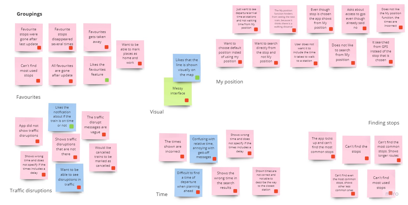 Read more about the structuring of data
This is how the biggest themes in the research can be summed up:
Incorrect results and directions
Many had difficulties finding even the most common stops, the
directions were wrong or didn't work at all, the wrong time were
shown, local buses or commuter train couldn't be seen in the app,
and error-message "can't understand the result" were shown.
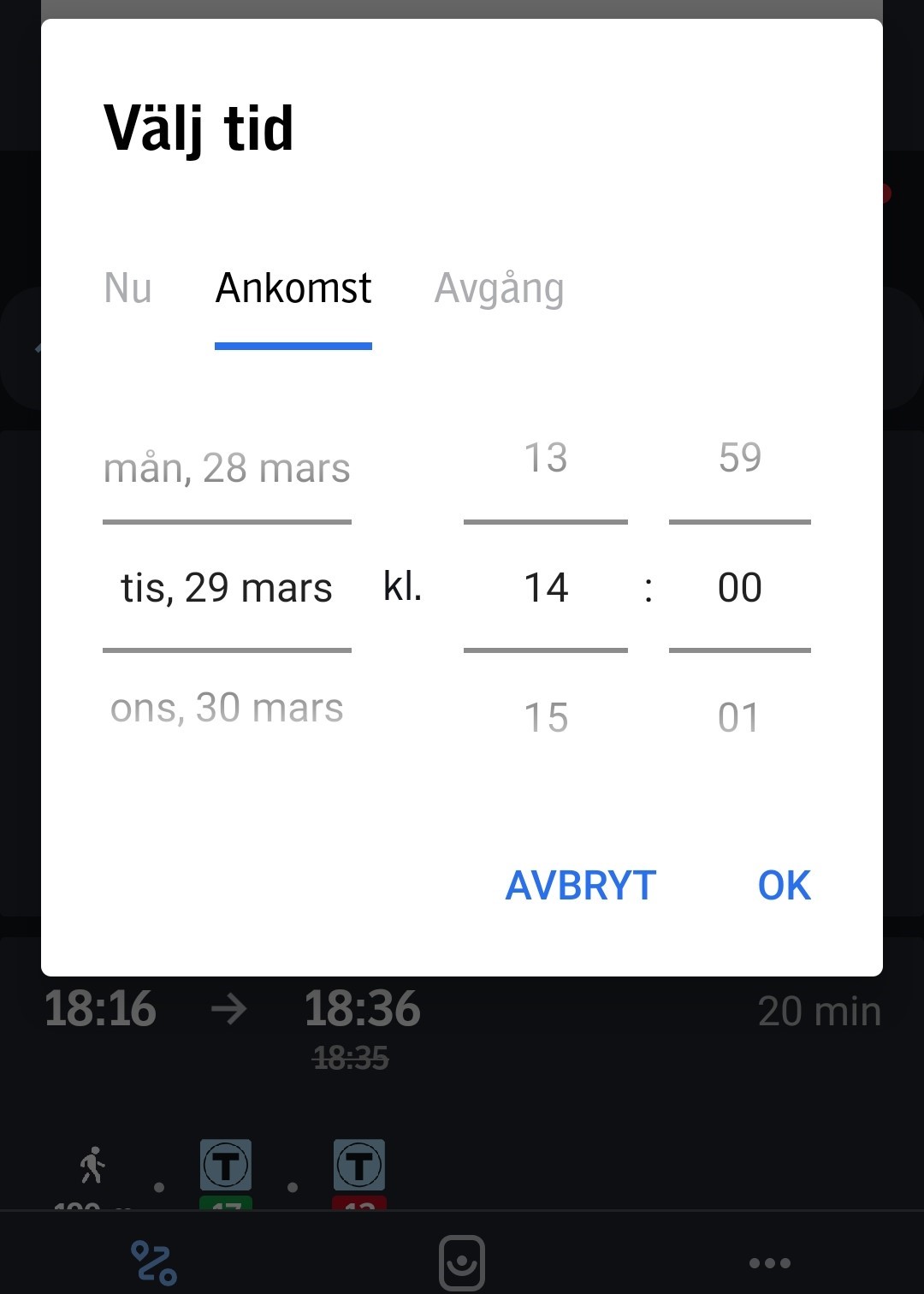
Non-forthcoming
No warning about traffic disruptions causes a lot of discomfort, and
planning a trip ahead is difficult when the time indications are
live time.
Disservice
To start directions from "My position" instead of the the station is
more troublesome than helpful. More often than not it doesn't match
with the time it takes the user to get to the station.
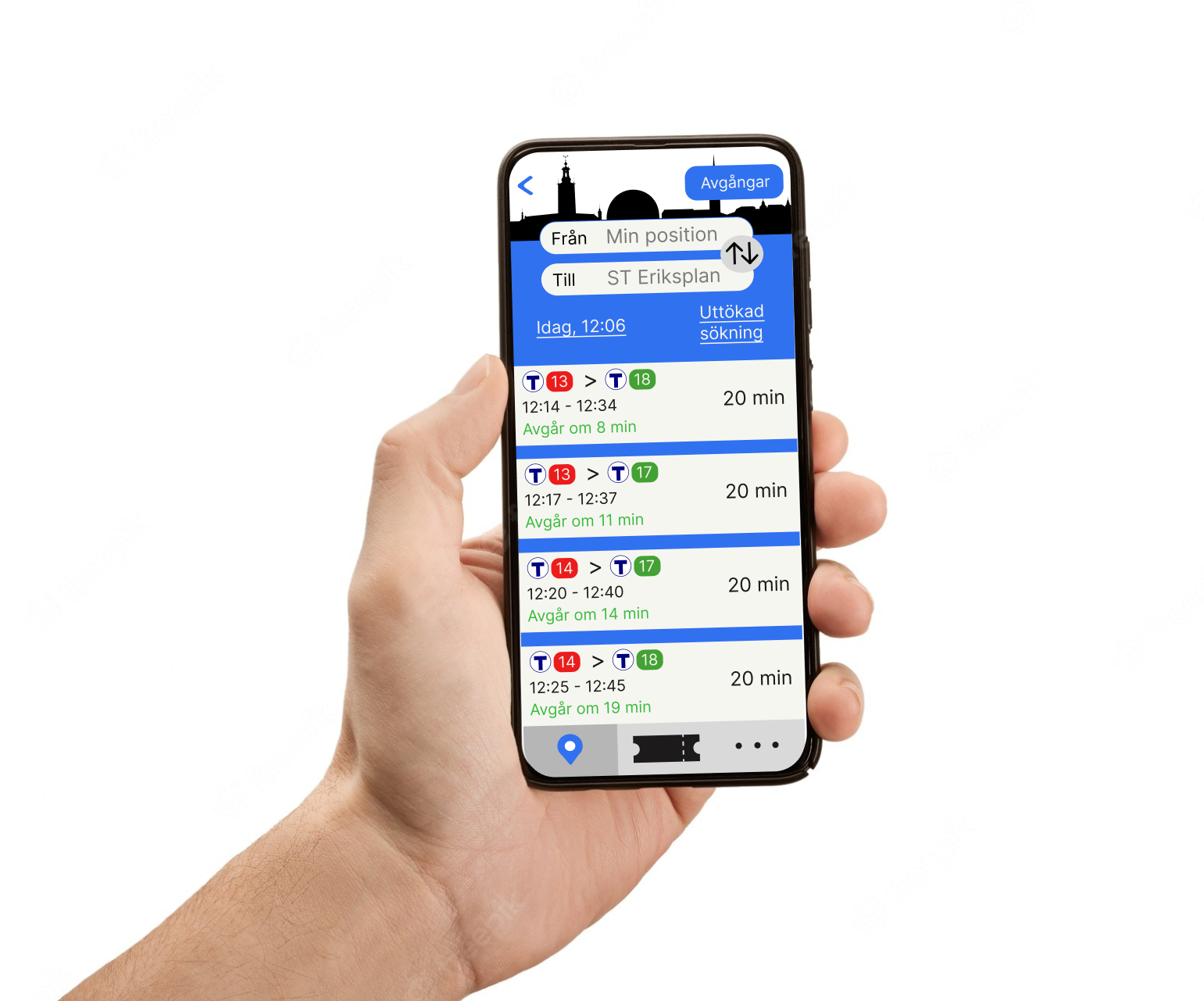
Visualization of transport
Using the metro lines colors and symbols makes reading the
directions easier.
Shortcuts
To make searching faster favourite stops are popular, and favourite
route is also recuested as well as most recent searches.
Interactive
Appreciated when the app vibrates when you are approaching your stop
and notifies if the train is not on time.
Let's put some structure to it
The insights from all of the research were organized through a customer journey map that places them in order and makes sure none of them is forgotten while designing the screens
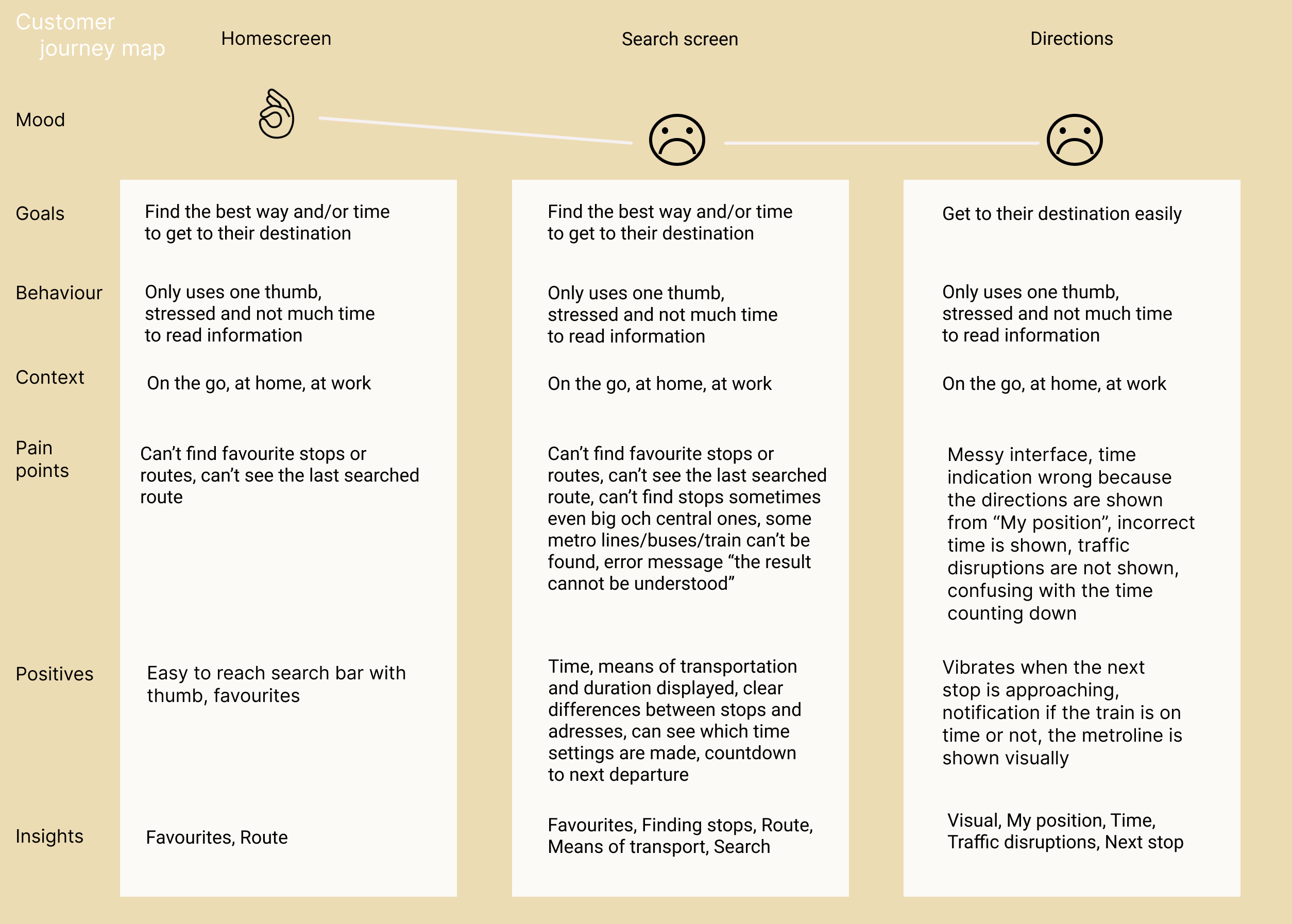 See customer journey map
Ready, set - design!
Before the sketching could start, the screens were planned out through a flow diagram. It describes every component and functions of the screens and describes one typical user flow. During this, everything in the customer journey map and the affinity diagram have been taken into consideration.
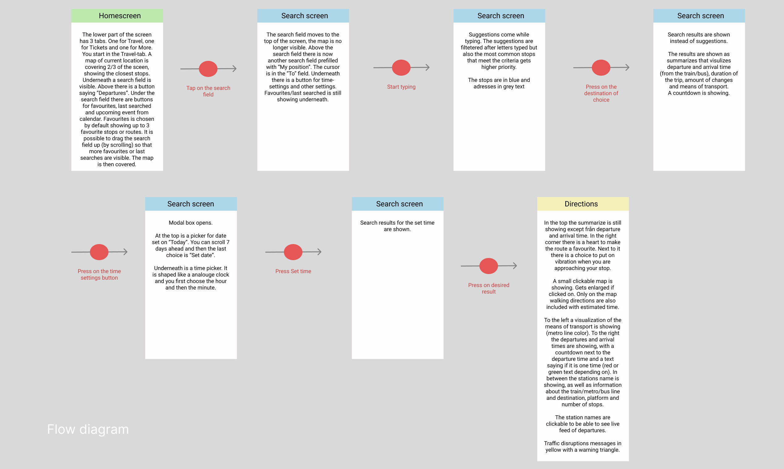 See flow diagram
Low fidelity sketches. To be able to iterate the design fast, I chose to do a first draft with low fidelity sketches that illustrates the flow diagram.
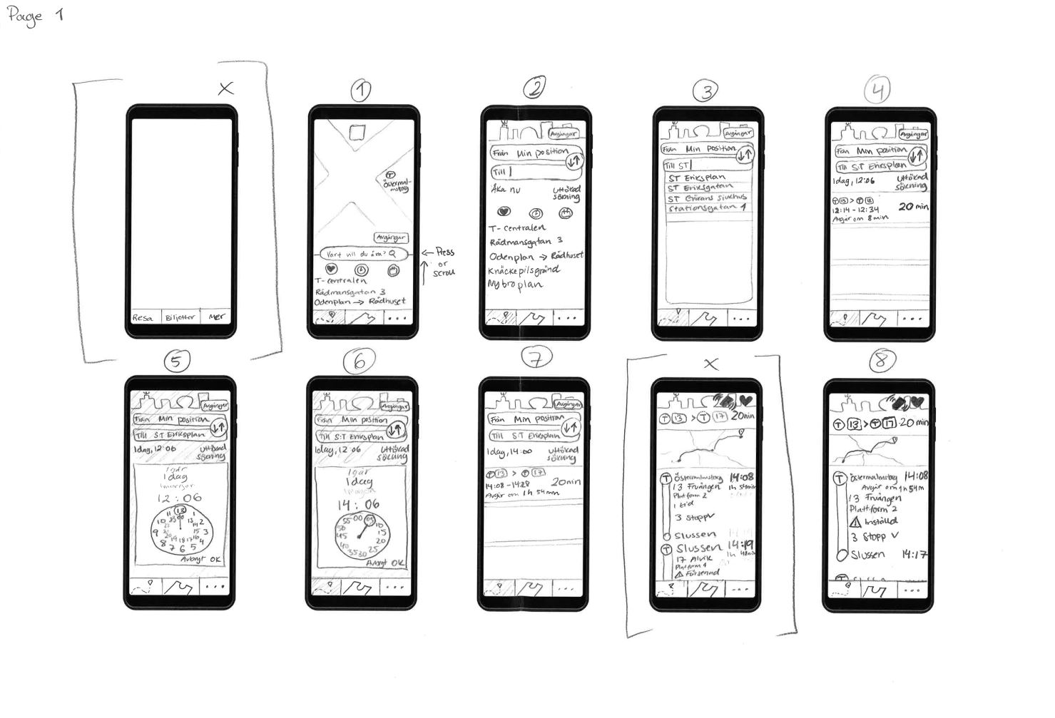 See lo-fi sketches
Prototype. Building on the first draft of the sketches, a medium fidelity prototype was made. The flow includes some extra sketches to fully illustrate the features described in the flow diagram.
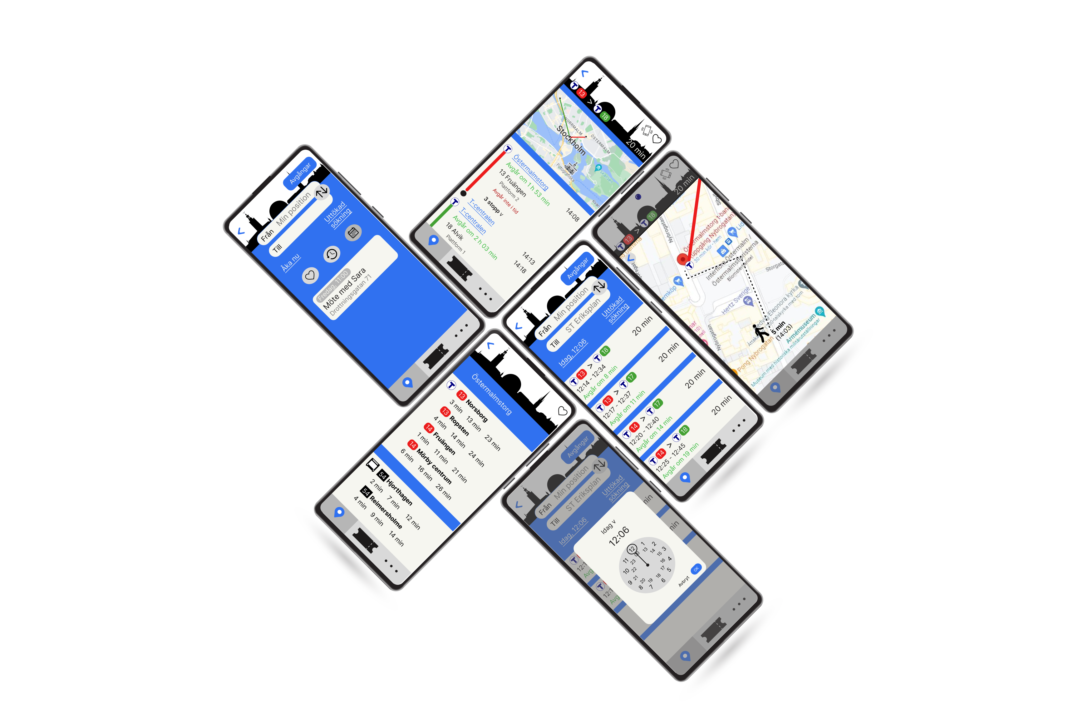 See hi-fi sketches
Reflections
Would the project have more resources I would have conducted several usability tests moving forward to test the design and make iterations on the way. Before the test I would interview the user. The purpose of the design of the test script is to get to know if it is a frequent user of these kinds of apps, in which context they use the app and for what purpose they usually use the apps. Also, which features they want in this kind of app, pitfalls to avoid when designing and what the mental model is when planning a trip. I wanted to test the "My position" function and therefore gave them an exact adress to search from. I also wanted to test more functions and chose the date-picker. See test script.