Wanderlust airlines
Website and booking process of an adventure airline.
Goal
To be the obvious choice for backpackers when booking their next flight. A booking process that is fast and intuitive with the target user in mind.
Context
Student project conducted during the course at The UX Design Institute
Timeline
8 months
Research
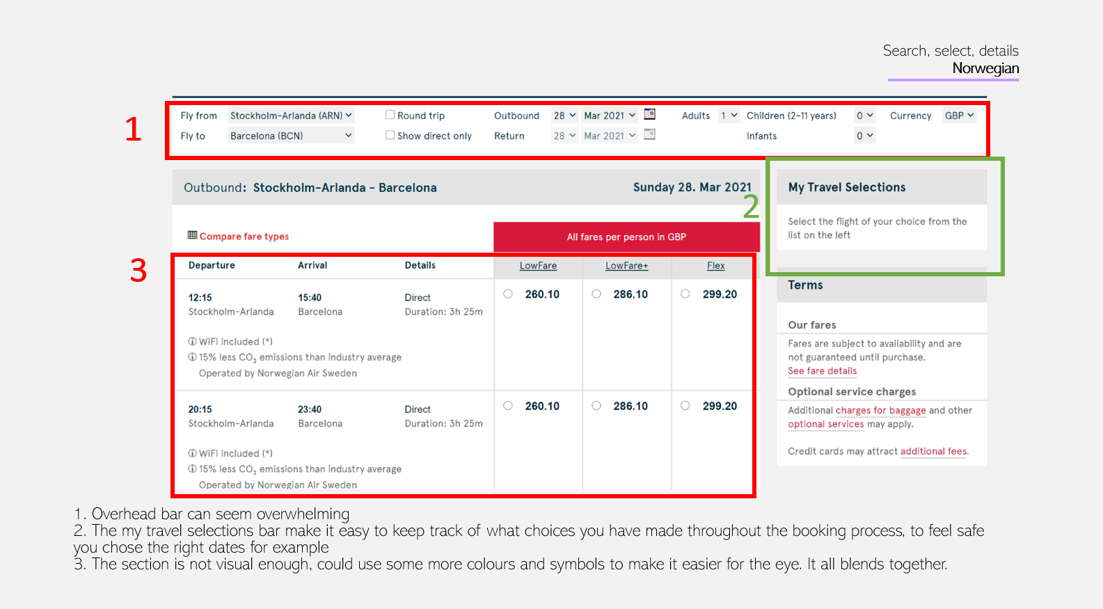
Competitive benchmark. Since backpackers usually have to be considerate of how much they spend, I chose to benchmark three budget airlines and one aggregator (Norwegian, RyanAir, Pegasus Airlines and Momondo). The objective of this research was to benefit from existing best practices and to identify which pitfalls to avoid.
 See complete competitive benchmark
It was quite suprising how different the websites were. I found some similarities that gave me an idea about which conventions there are that must be followed, and also a lot of inspiration. There was also many not so great features that I instantly felt like I needed to avoid. However, there are some aspects that I can understand that they included from a pure business viewpoint, such as the "Don't miss out" model-box when you don't want to make a seat selection. The biggest take away was to make the interface clean and simple to understand, and to avoid annoying ads or forced memberships. As stated above, I understand that those aspects are probably placed there out of business aspects.
 See complete survey
Survey.To learn more about the goals of the targeted group and which features they use most frequently, the objective of the survey was to find out the following:
- Which tasks are usually done on the computer vs which are done on
the mobile. This tells me what to prioritize on the hompage.
- Which context they usually are in when they visit an airline
website, to know what to take into consideration.
- Pitfalls to avoid
- Which information is most important when looking for a flight, to
make this information stand out on the page.
- What is usually purchased when booking a flight, to know how to
organize the workflow.
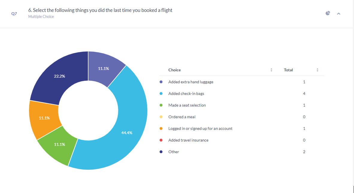
The survey showed that users use a computer to check prices, dates or travelling options. Also to check-in, book flights and to secure a safe payment. The context of use was usually at home. Pitfalls to avoid is to not show the full price upfront, an aestethically unpleasing website and rules and policies presented in an non-understandable way. Most important information was price and then dates. If anything extra was purchased it was usually a check-in bag. The participants were recruited amongst my friends, specifically friends that I knew had traveled alot. The survey had 7 participants.
 The clip is shared upon request.
Usability test.The test was conducted in person. The objective was to learn about the context of use of the target group as well as their goals and behaviour. The questions and tasks centered around longer one-way flights for one or two travellers to create a appropritate context.
Most important findings:
- The page should not be overwhelmed by ads or too much information,
and the important information should stand out in the form of bigger
letters or by being more colorful.The user wanted to be sure to not
miss any important information due to former mistakes and the process
was time-consuming since it was difficult to prioritize the
information. Price is the most influencial factor when choosing a
flight, but it is also important that the date and time is clearly
displayed to not risk missing the flight. Regarding this the itinerary
was a helpful element of the process.
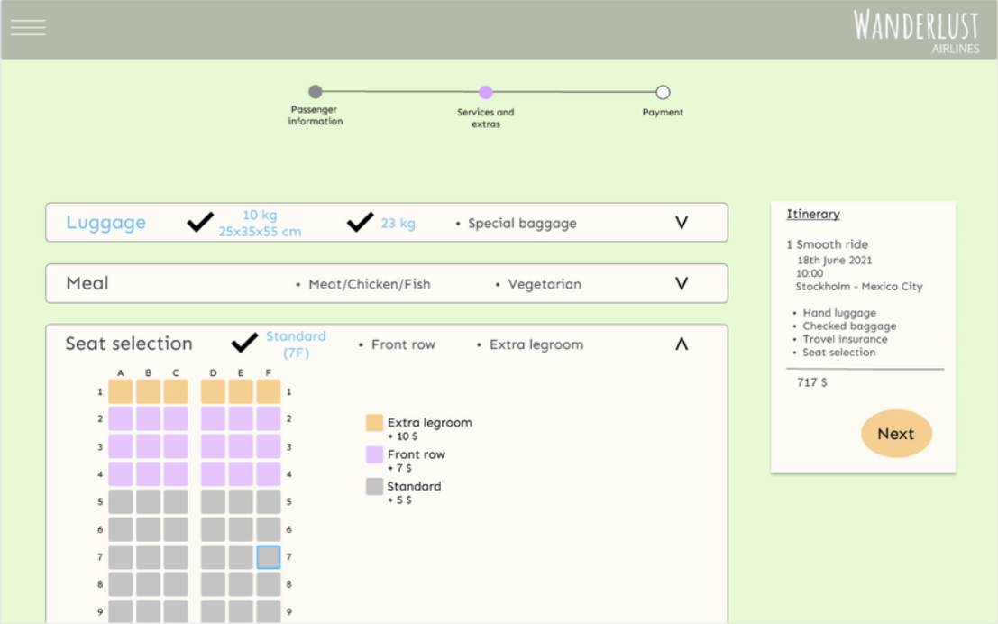
- The user normally only adds a cabin bag and a check-in bag, and
wouldn't normally make the ticket refundable. The differences between
the fare types were too big.
- It is helpful when the calendar on the homepage shows which dates
are available and cheaper. The mental model for lower prices is the
color green.
Define
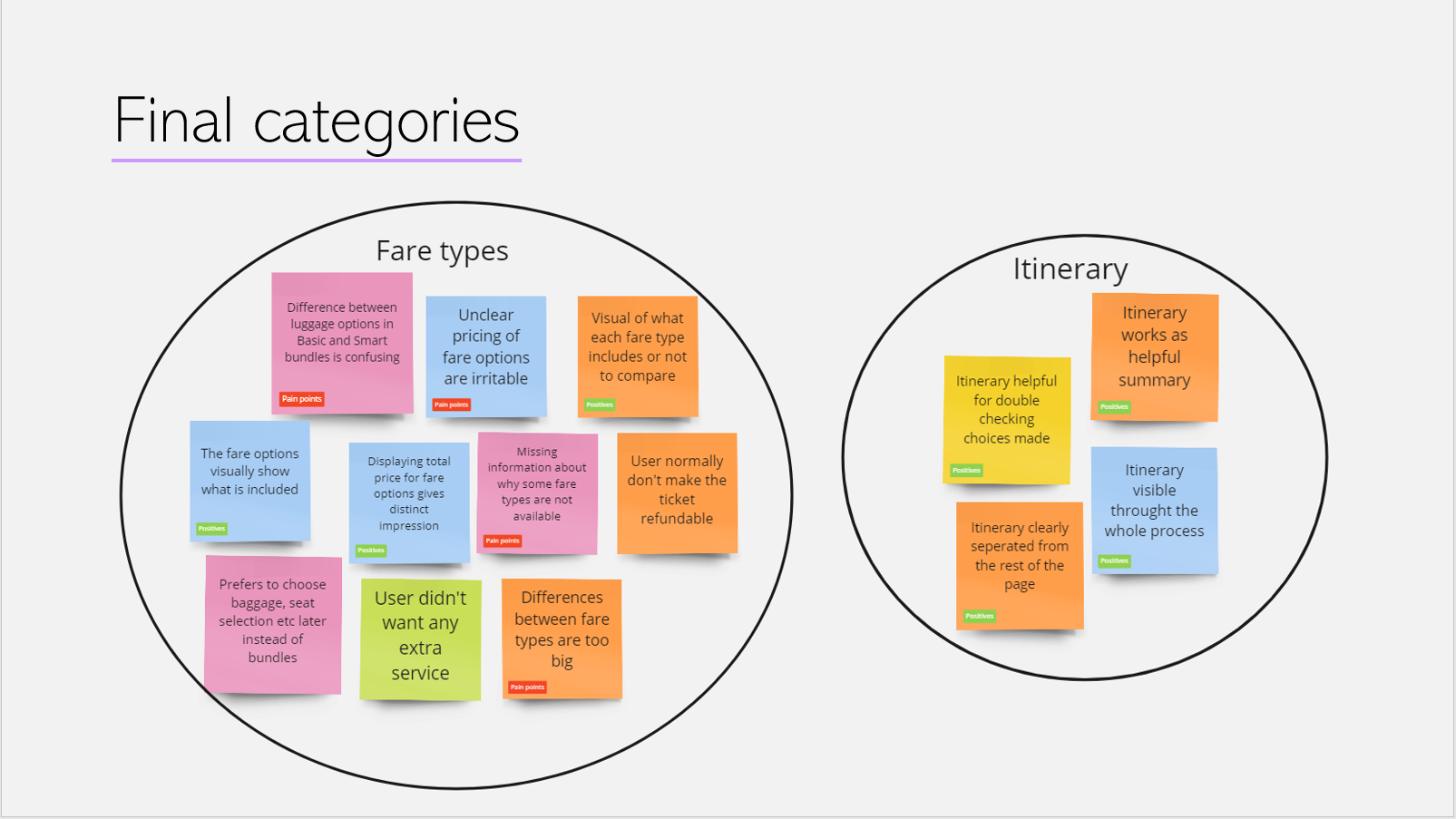
Notes and affinity diagram. To structure the research data each finding was noted on a post-it and tagged as a pain point or a positive.The color of the post-it indicates the source of the finding. It was first laid out as an overview, then a first grouping was made. Afterwards, adjustments were made to form the final groupings and they were given category names. This was conducted by myself.
 See complete affinity diagram
The categories outlined which parts of the process that was important
to focus on when designing: Search/select dates, fare types, search
again bar, price, flight time, search time, itinerary, luggage,
membership, categories, menu and seat option. The last categories
could be applied throughout the whole booking process: behaviour,
aestethics, flow, communication, and technical.
You've got some good notes within your affinity diagram. The tags in
the groupings is great to help establish the positive and negative
points
- Student success team of The UX Design Institute
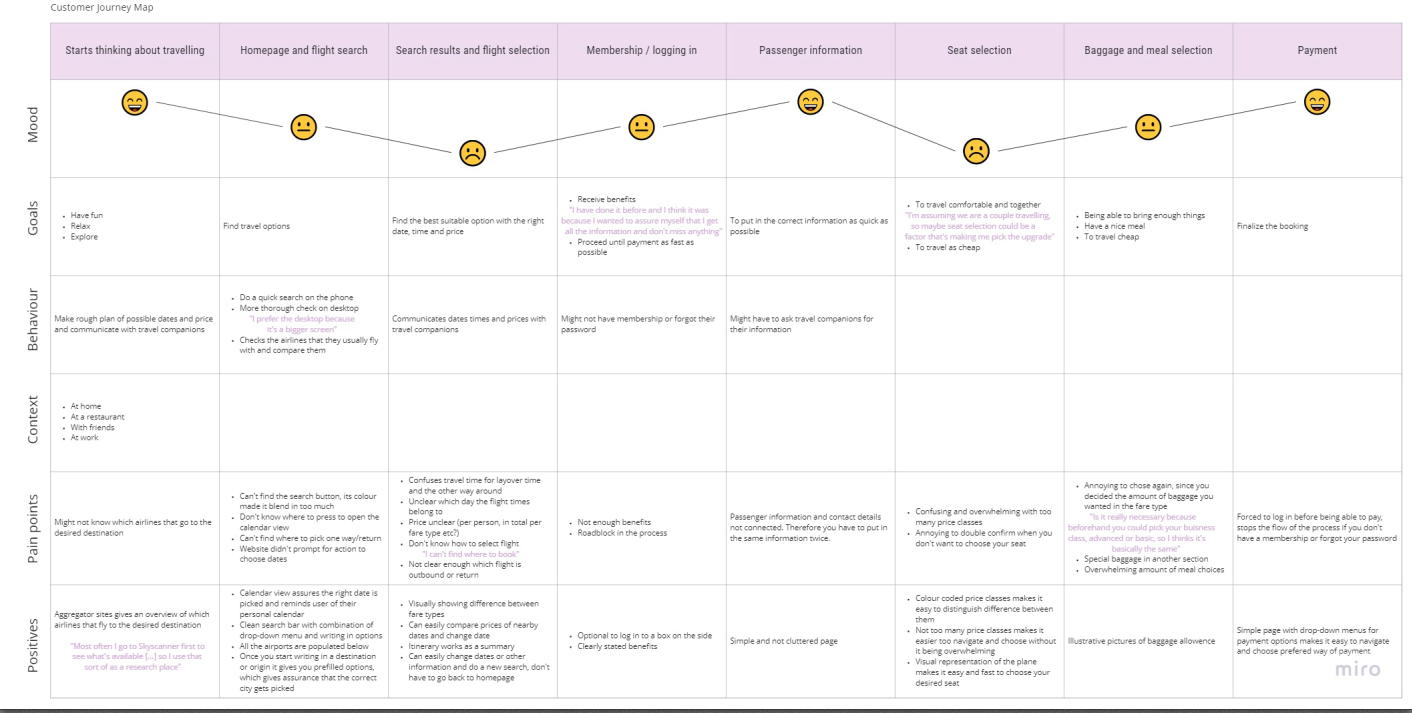
Customer journey map. To structure the analysis of the data further, a customer journey map was made that showcases the average users experience. Since it visualizes the data in chronological order it makes it more clear where the users flow easily and where the road blocks are.
 See complete customer journey map
The customer journey map shows that the road blocks are usually at the point where the user has made a search and are looking thorugh the flight options and also when making a seat selection. Also the baggage and meal selection, membership log-in and homepage was partly a road block. In those areas more innovative ideas needed to be appllied. In the remaining areas, passenger information and payment, mostly conventions was followed.
Design and validate
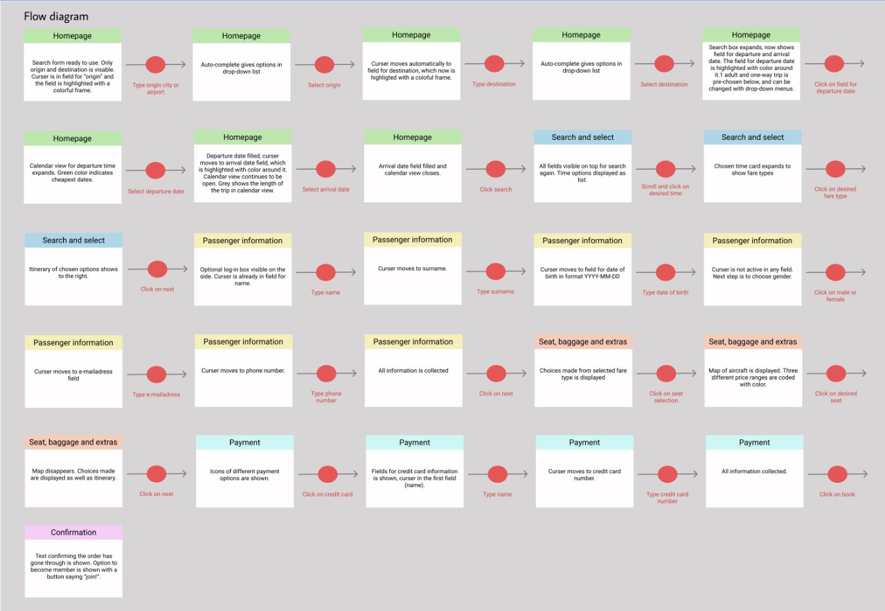
Flow diagram. A primary use case was defined that included the most crucial areas that was outlined in the affinity diagram and the customer journey map. It starts from the homepage up until the booking is confirmed, and includes seat selection.
 See complete customer journey map
The objective was to design a flow diagram that demonstrates how the
issues of this use case would be solved. The red dots represents each
action that is taken and the rest of the colors each represent a page.
A flow diagram makes it apparent if the user will move through the
site easily or not, and it made me aware of minimizing the amount of
actions the user has to take.
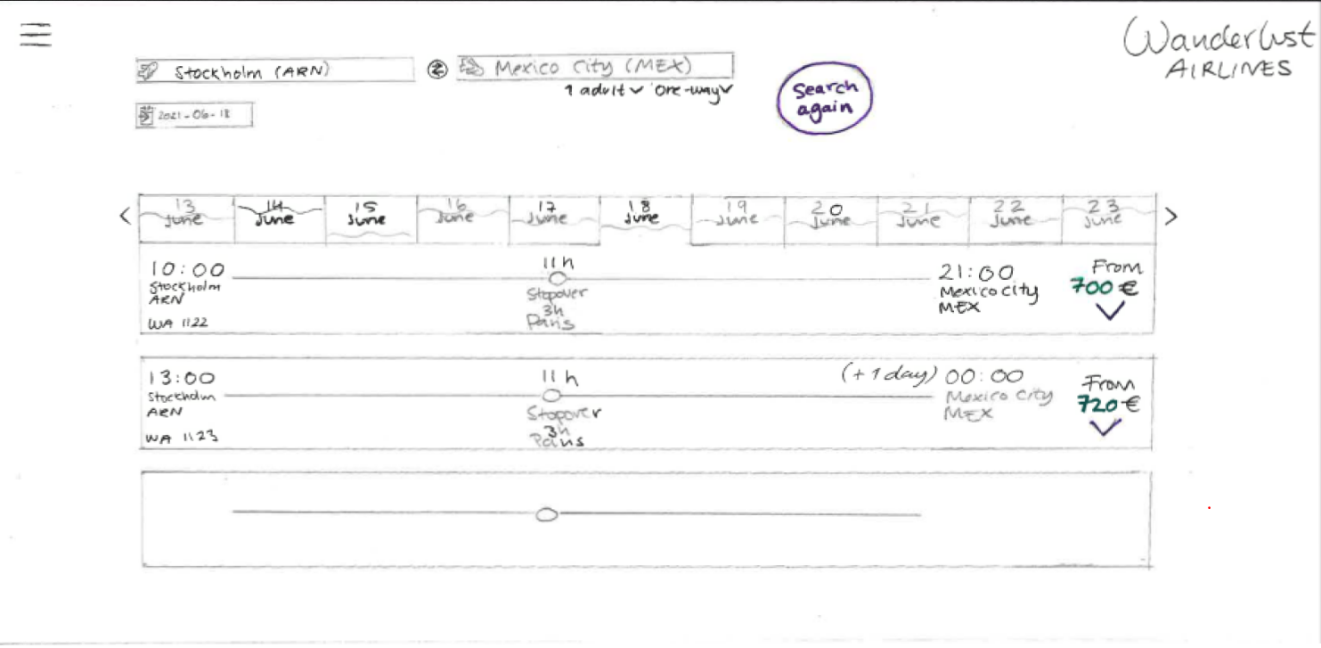
Interaction design. The screens from the flow diagram was sketched out by hand as a first draft. Insights from the affinity diagram and the customer journey map was also taken into consideration since not all the details could be addressed in the flow diagram.
 See lo-fi sketches
It is a fast way of testing the layout and visual hiearchy that was imagined during the previous step. Amongst other things I tested how to make it clear what the flight time and the stopover time is, without them being confused with each other.
A good level of consideration went into your sketches here, nice work
Priscilla. I can clearly see your thought process and they will be
helpful when it comes to building your prototype
- Student success team of The UX Design Institute
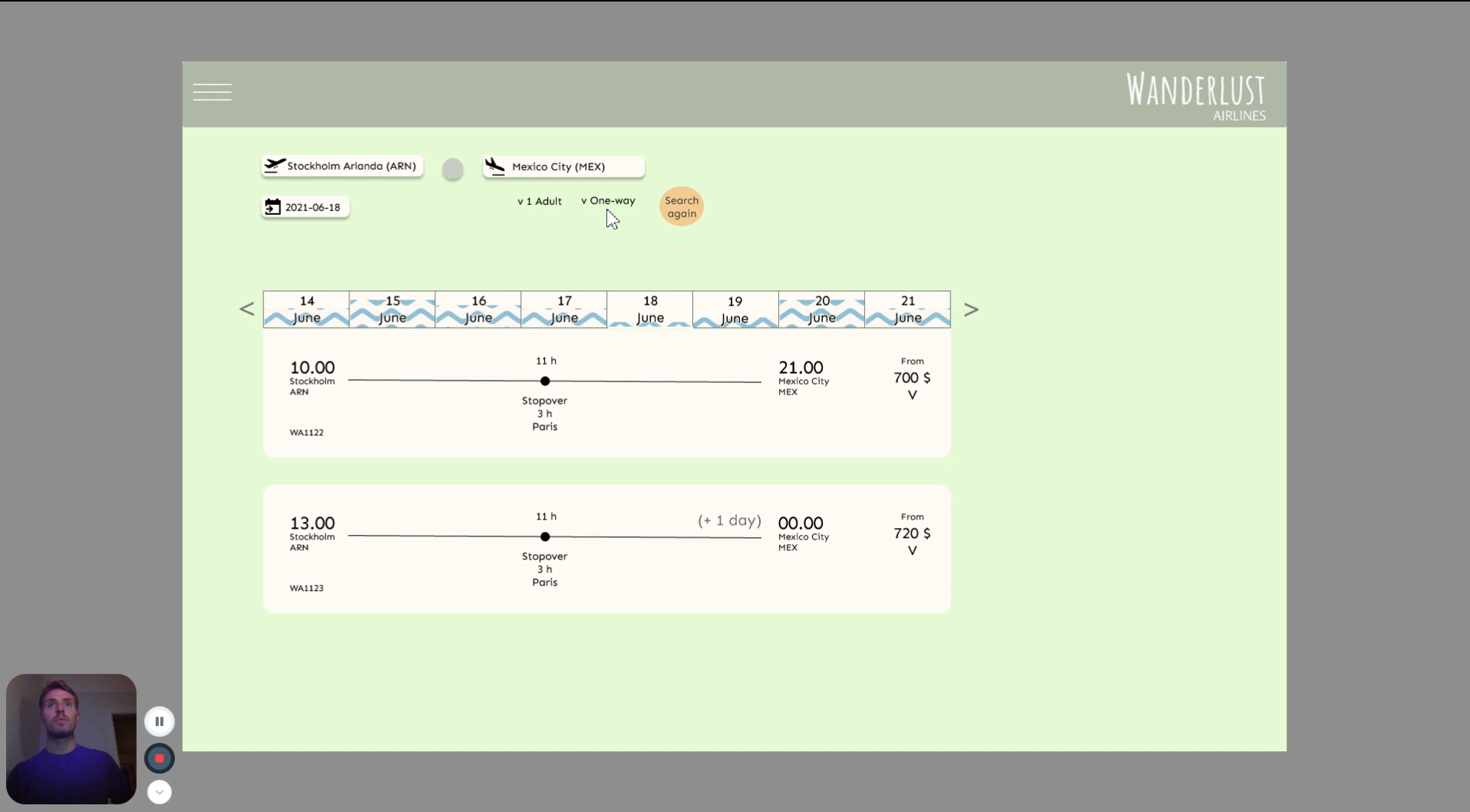
Prototype. To be able to test the solution, an interactive medium fidelity prototype was made. It tests basic interactions, the layout, hierarchy and flow.
Mainly choice of colors was made at this stage, since most hade been designed beforehand. The backdrop of the the homepage is a picture to inspire the user of possible places to travel to and to elevate their wanderlust further. The prototype has been updated after being tested. The first version of the prototype is shown in the usability test.
Usability test. The objective was to test if the solution helped the user reach their goal, and what could be improved.
 The clip is shared upon request
During the test I found out that the illustration of price variation between dates was not comprehendeble, which was a valuable insight. After the test I went back to the iterative stage and redesigned some parts of the prototype.
Deliver
Wireframes. The objective was to define and communicate the rules, feedback and form design.
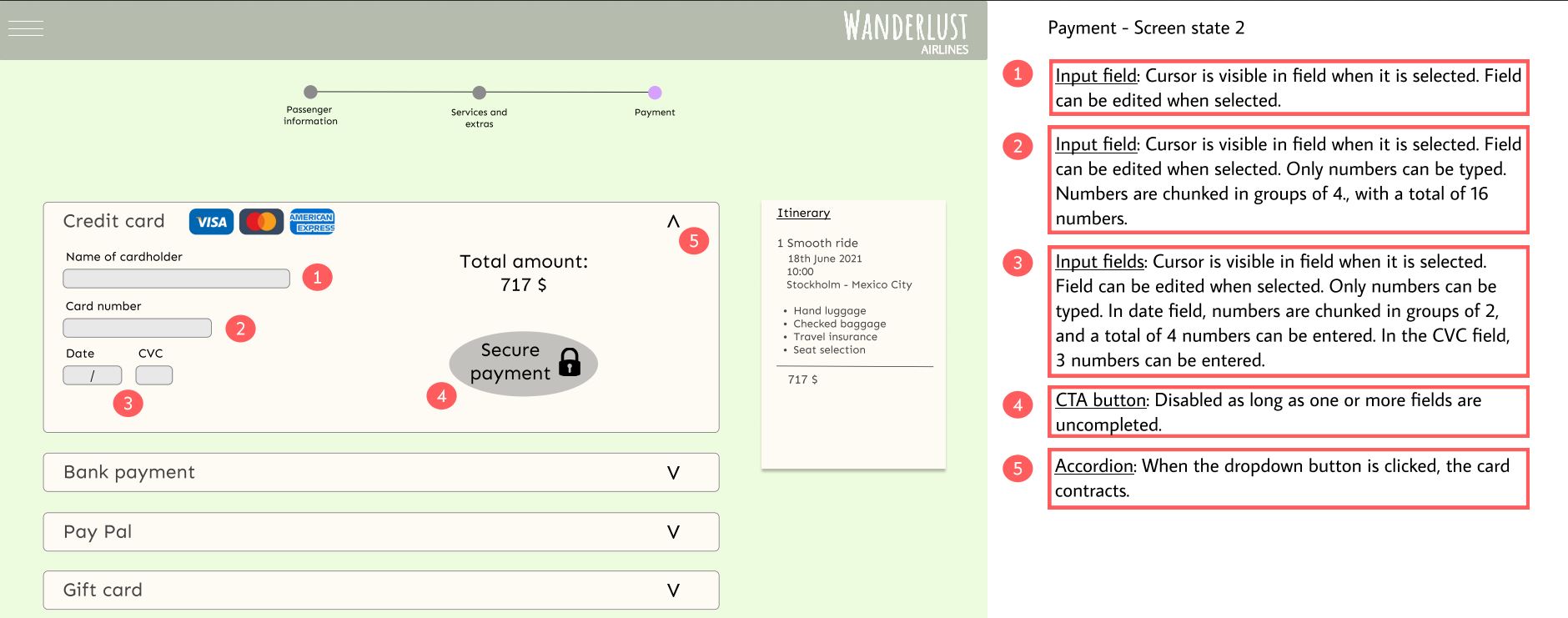 See complete wireframes
The comments are clearly communicated and will be helpful to any
developer building the website
- Student success team of The UX Design Institute
Reflections
To gain richer insights I would have conducted more research, especially more usability tests but also a larger number of survey participants. I would also make several design iterations followed by usability tests to be more confident of the designs success rate. Also, I think it could be beneficial to split up the booking process and make usability tests that focus on fewer tasks. That way the research goals are more precise and the observations are richer.