Vibedrop
Goal
Creating a space where artists and producers can upload tracks, gather and share feedback, and keep everything organized in one place.
Context
This project was part of a cross-functional course where UX-designers and developers teamed up to build a digital product from concept to prototype.
My role
UX-designer. I was responsible for research, the UI and design system as well as the UX and design of screens/prototype.
Duration
12 weeks
Greatest insights
Market research
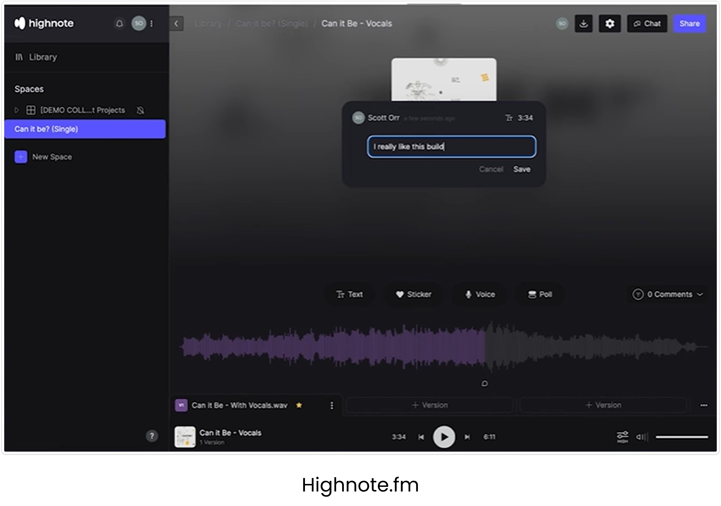
Pins representing comments in a visual waveform
Possibility to send voice notes as comments
Ability to toggle between versions
Organized file structure
Overview that keeps track of new comments, last modified and status
Drag-and-drop function
Add collaborators, set access for each one
Target group interviews
Count: 5
Producers and artists, both established and hobby musicians
Producers are usually like project leaders of a track. Feedback is gathered through text and they send the tracks through Dropbox or similar platforms.
A song collaboration can involve many people, sometimes leading to miscommunication since those involved text and call each other one on one.
The risk of beats or lyrics getting stolen makes many cautious, some only sending their work in progress to friends and family.
Complicated onboardings will hinder collaborators from leaving comments.
Mobility adds value, since they often listen while on the move or want to test the sound on different speakers (such as in the car).
The audio quality needs to be uncompressed to get an accurate experience of the track.
Usability testing
Count: 5
The prototype was tested on users given these three tasks below, as well as discussing the level of structure, safety and familiarity they experienced 1. Start a new project, 2. Read the latest comments in a project, 3. Add a new version
Missing the ability for deeper structure in the sidebar, such as grouping projects for an album or genre. Sorting and searching would also add value.
The dashboard could include more than just recent activity in project, like overall stats that could be of interest.
Sometimes you want to share a certain part of the track, called ‘stems’. For example it could be a track with only the guitarr.
Usually a picture for the song is not ready at this part of the process, so it doesn’t have to take up such a big part of the interface.
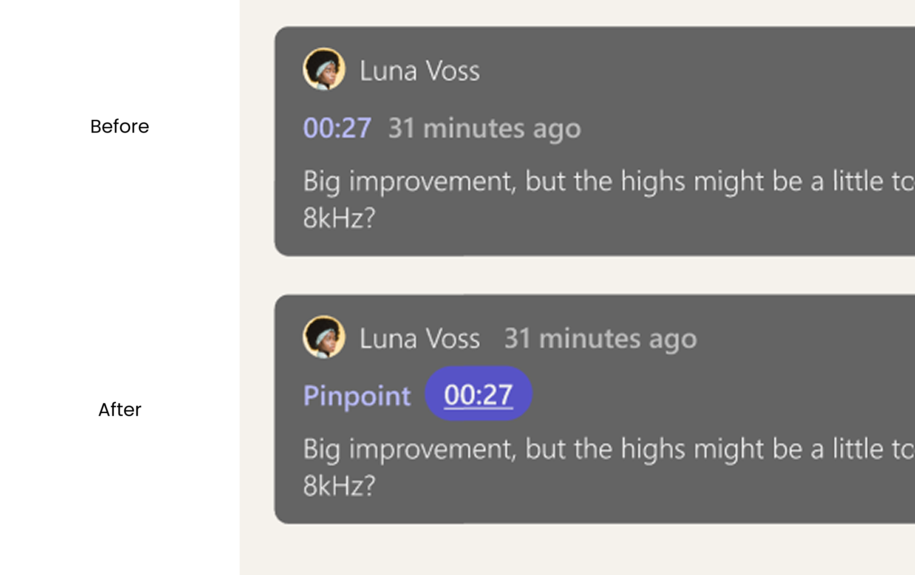
The timestamp in the comments are interpreted as the time the comment was left, instead of the time in the track the comment refers to.
Many of the users was missing a “go back”-button. In case of many projects it would be easier than clicking at the project in the sidebar.
Gerialla testing
Count: 8
An A/B-test was conducted to explore how to make the meaning of the timestamp clearer, after gaining insight from the usability testings that it was not. The test included the original design, an iteration with a supporting text and an interation with a supporting icon. Before the test I had found that the ‘31 monutes ago’ could be confusing and making the user draw the conclusion that the timestamp was the time the comment was left, so I put it next to the name.
The timestamp in the comments are interpreted as the time the comment was left, instead of the time in the track the comment refers to.
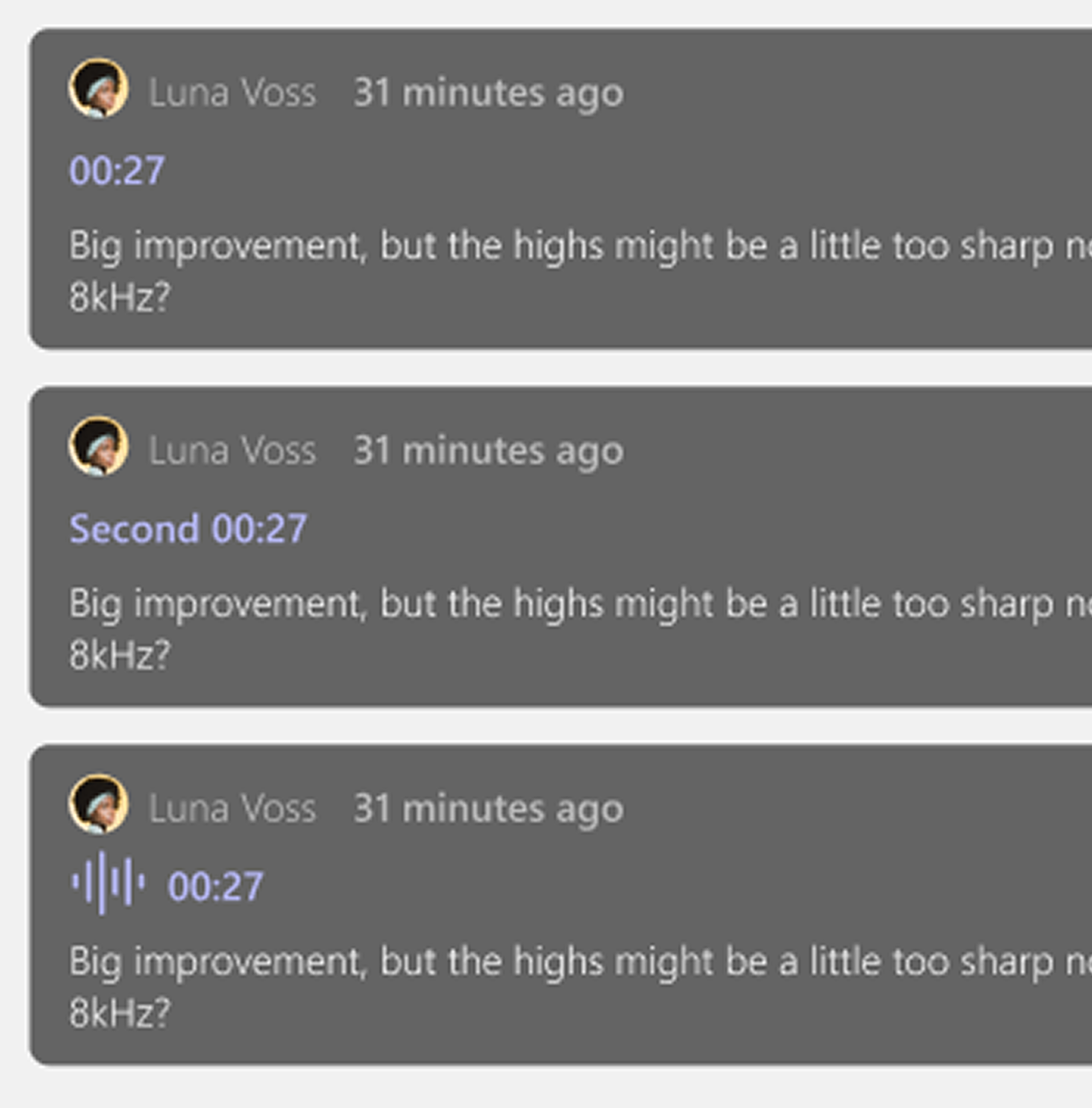
The results were scattered, giving insight that none of them were satisfying.
The icon was interpreted as a voice memo.
The color is to light and the timestamp doesn’t stand out enough from the rest of the text in the comment.
Many suggestions of a suiting supporting text was made: ‘commented on’, ‘pinpoint’, ‘audio pinpoint’.
About the process
As this project meant designing and building something from scratch it was needed of us as a group to make a MVP to fit the scope of the project.
From the market research I found that what seemed to be the best practice was a sidebar to the left with a file structure of all tracks in progress. Also, a waveform with pins for the comments was common, but this we scaled down for the MVP. Instead we focused on being able to leave comments on a certain version with a timestamp referring to a time in the track.
I also found during the interviews that some of them were familiar with the solutions that is found on the market as of now, but neither of them were using them. Everyone was still using Dropbox or Wetransfer to send the tracks and then gather the feedback through text. A more organized way was wanted but still the options out there was not being used. The threshold of usage seemed to be to high. Someone had tried to make their collaborators use a platform for leaving the comments, but they still texted him their feedback. Therefore, we discussed a solution in the group where the users would be able to send a link to an e-mail where the recipient could easily log in with their google account or similar. For this project we did not have the resources to implement it.
And for this reason it can also be useful to scale down to an MVP and work your way forward, to see what really brings the user value. The usability testing gave me insights and ideas of a more delicate file structure in the sidebar where you can add folders and drag projects to folders, as well as a search bar and filtering function. In a new iteration I would also add tabs in the page of a project, for dividing the tracks in different ‘stems’. In the comment page I would like to explore further how to incorporate more visual elements of who left a comment and where in the track, without cluttering the page too much.
Design system